Designing AI that care teams trust
Overview
Laguna started as a care management company, with its own clinical staff and software. When AI became practical to build on, it saw a chance to give care management teams an AI copilot: one that would take on the admin work, like documentation, so case managers could focus on the people in their care.
I joined as head of design in January 2024 and became lead designer for the MVP that April, after working alongside our UX designer in Israel. I designed the end-to-end experience for call prep, live call support, and post-call documentation.
The first five case managers quickly went from cautious testers to enthusiastic advocates, driving a rapid rollout across teams. For our health plan client, employee satisfaction went up, and post-call documentation took 66% less time.
Project highlights
Outcomes
66%
less time on call documentation
+27%
satisfaction with call prep
5 → 300
case managers in 14 months
“My confidence and quality of calls has improved so much using this. As a clinician, and the quality of my work, I can tell the difference.”
“They shifted from a cautious observer to a confident user. And for a nurse, that’s a huge step.”
The challenge
Overwhelming admin burden
Case managers were spending up to 75% of their time on admin tasks instead of member care.
Laguna Companion is designed to free them up to focus on people instead of paperwork. It generates call documentation, speeds call prep, and provides personalized feedback.
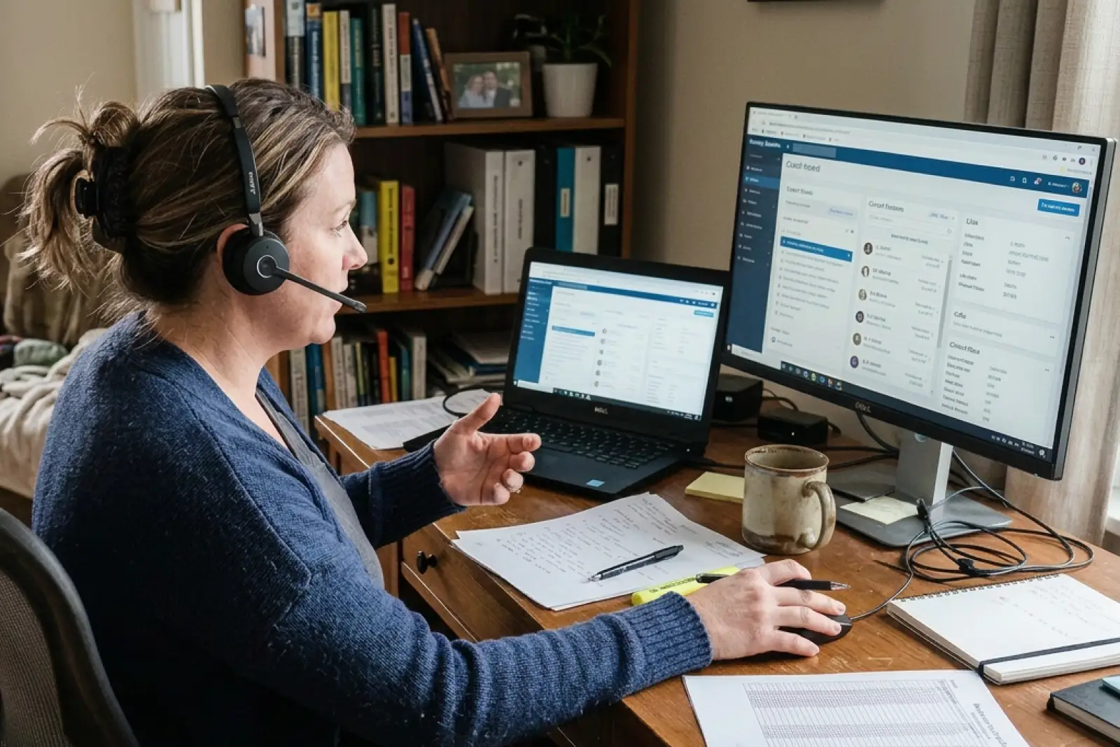
“It seems prehistoric to have to copy a template from MS Word into my record. There should be easier ways to document our calls.”
Mapping the workflow
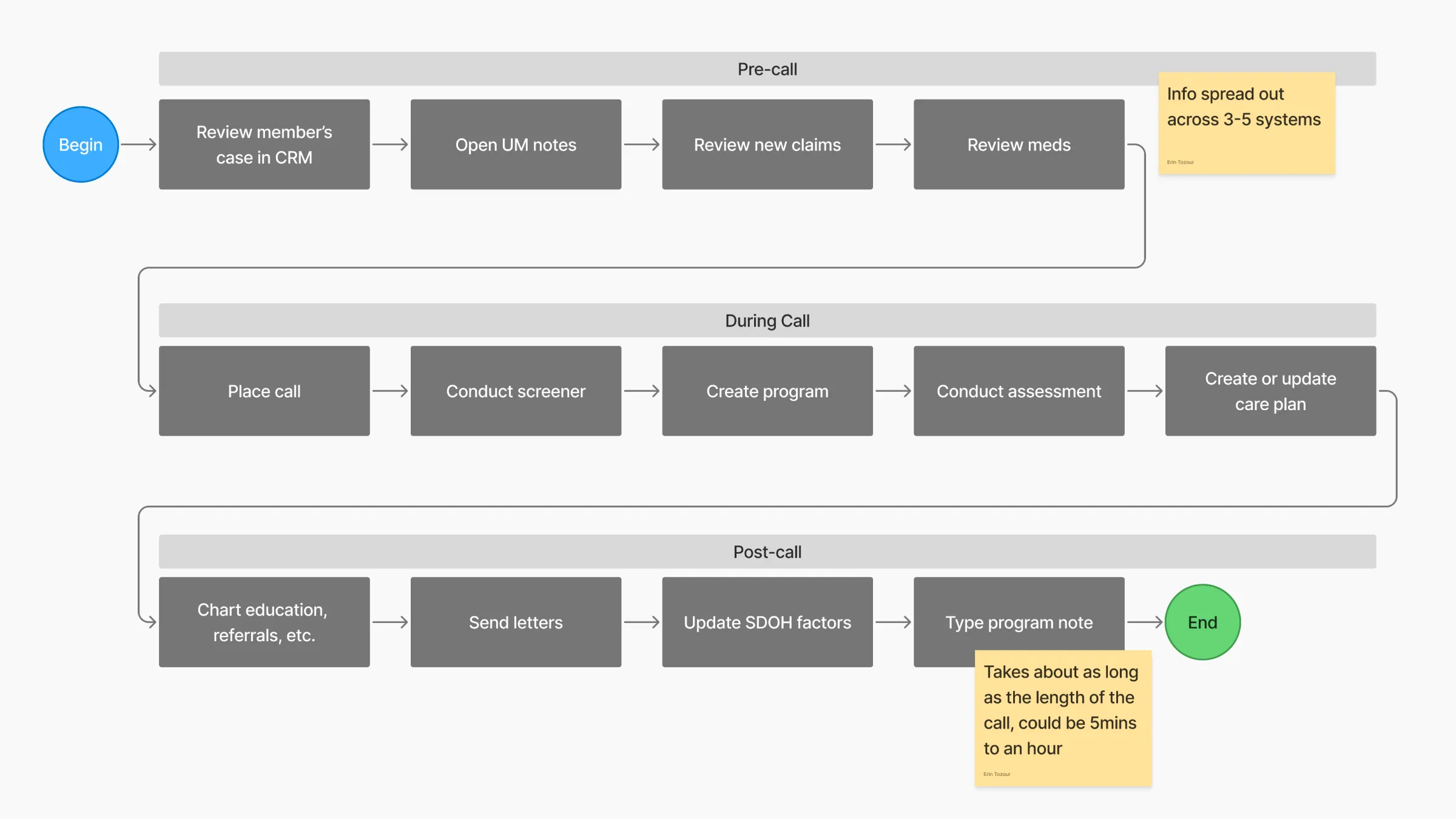
Through interviews with case managers, supervisors, directors, and VPs, I mapped the full call lifecycle (prep, live call, post-call documentation) to understand how Laguna could fit in.
Takeaways
- The post-call note is the biggest time sink.
- 3–5 sources reviewed when prepping for a call.
- Split attention on calls meant missed member needs.
- A long, redundant SDOH list led to the same generic picks every time.
- Supervisors lack visibility to personalize coaching.
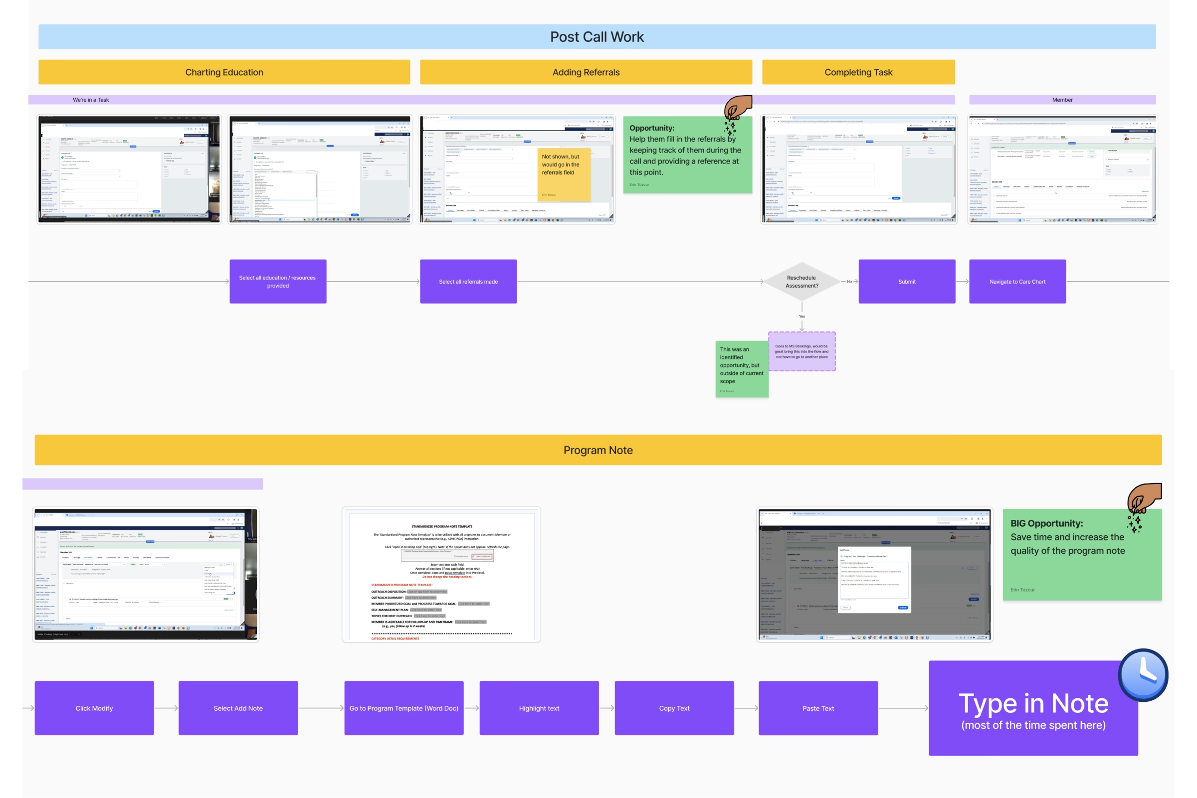
Sketching ideas
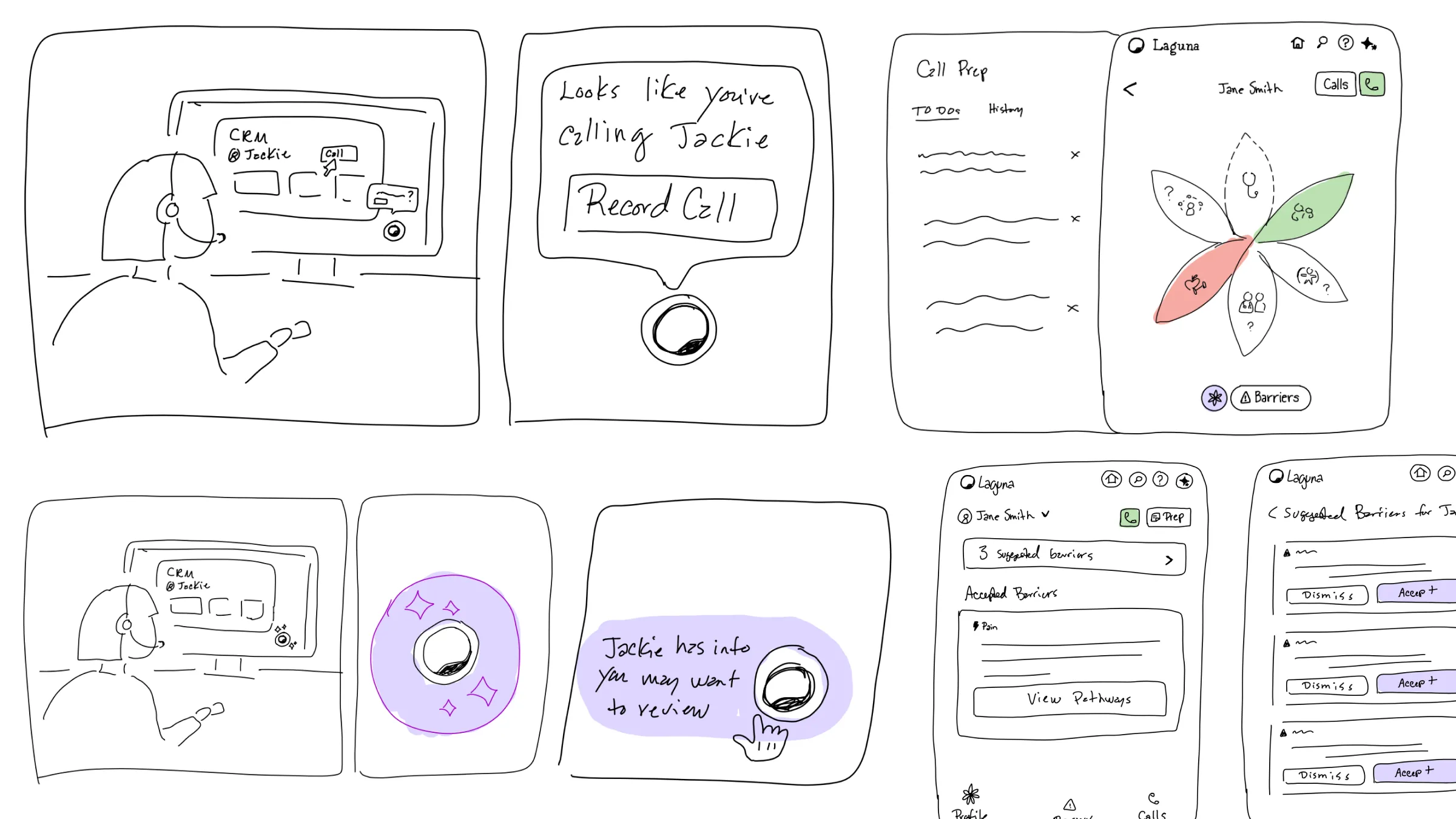
I started by sketching ideas quickly by hand so that I could align with Laguna’s Chief Product Officer and our VP of AI on how the user experience might look. I explored ideas for connecting to calls, viewing the member’s SDOH factors, navigating barriers identified, and viewing call prep.
Testing call prep and real-time features
Once we had a shared vision, I created prototypes to test. While post-call documentation was becoming common with ambient AI applications, there were some more novel features for call prep and real-time insights that I wanted to test with clinicians.
What I tested for
- Would users understand the flower and how to navigate it?
- What info is most useful for call prep, and how would it be used?
- Could the barriers be used to select more specific SDOH items?
- Would nudges and other dynamic content be digestible during live calls?
- In general, is the UI intuitive and usable? Do users know what to do?
The IDOH Flower
The IDOH Flower was intended to give case managers a 360° view of a member’s “Individual Determinants of Health.” Using progressive disclosure, we would indicate member needs across 6 categories and the user could drill down for more info. I chose a flower to reflect the nurturing nature of the care manager.
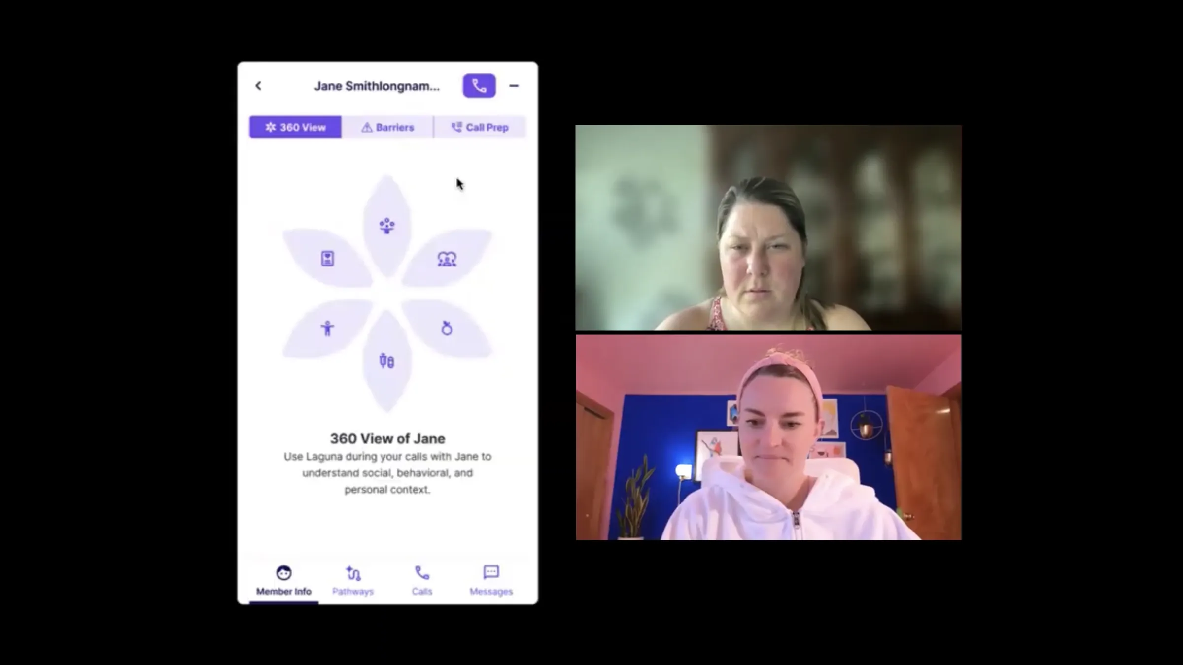
“So this is like a quick look at this person before you call… this would jog my memory if I haven’t had too many calls with them.”
“I would honestly be afraid of this flower. I would be like, I don’t know how to start there.”
Barriers
Laguna was already designed to extract SDOH factors from conversations. In our conversation with health plan leadership, they liked the idea of Companion presenting the barriers that were mentioned on a call so that the clinician could more easily find specific barriers in their own CRM.
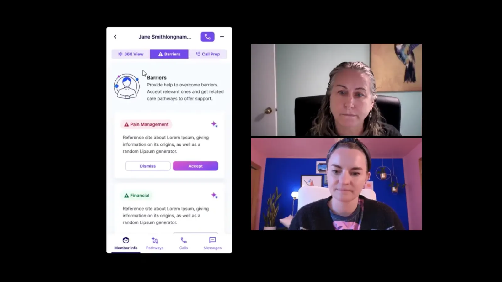
“The whole point of what we do at our job is like getting them over their barriers… so this would be great.”
“Our barriers align more with the barriers that generate from Change Health.”
Suggested actions
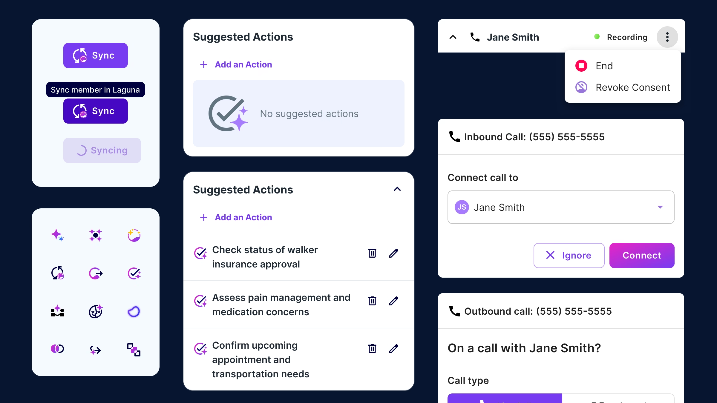
After each conversation, Laguna Companion would extract suggested actions for the next call. These were available within the call prep tab and intended to help users set goals for the next conversation.
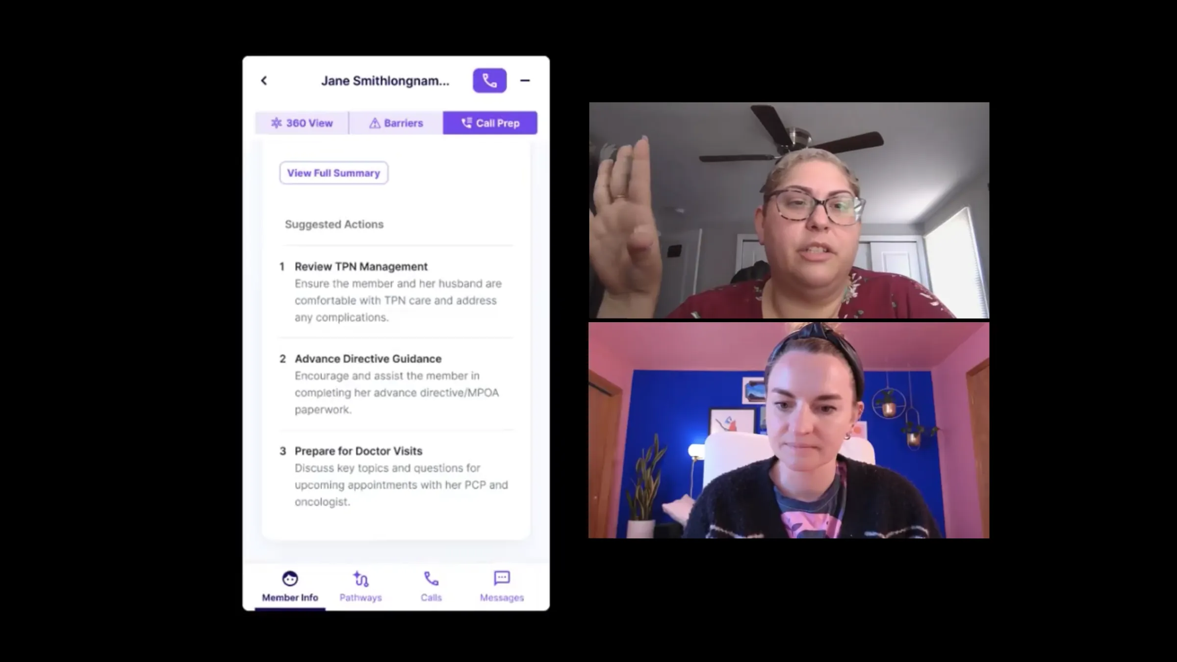
“This is nice because it’s all right there versus having to click on different tabs”
“Because they have one, two, three, this is showing the level of importance”
Live call view
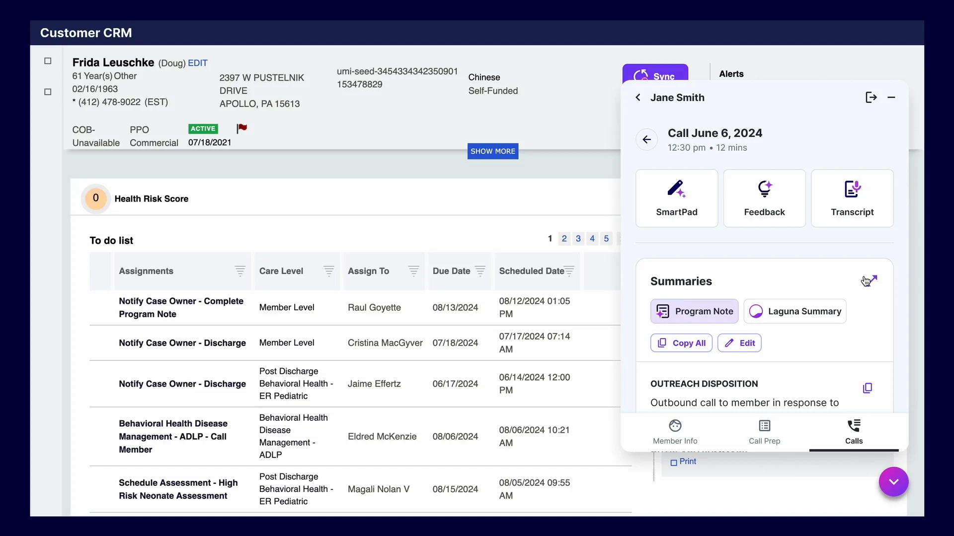
We wanted to provide member context during live calls while also presenting dynamic insights from member barriers to conversation feedback. I tested a side by side view of the main app with a live call drawer.
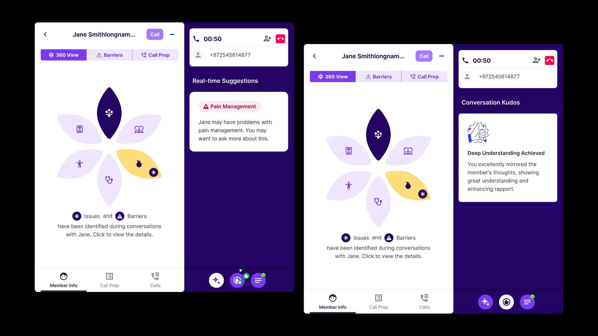
“I’m not sure where I should be looking”
“Nurses are used to multi-tasking, so I think it could be helpful. Just depends on what the info is”
Improvements needed
- Simplify member detailsTo simplify the member info tab, we removed barriers, since duplicating what the existing CRM content showed added little value.
- The flower needed clarityI added labels and redesigned how statuses were presented. I also added a list view per user request.
- Numbering implied clinical judgmentUsers were concerned about the AI overriding their judgment, so I dropped the ordering of items.
- The live call view was crowdedI picked one focal feature and called it the SmartPad, then moved the other features one click away.
Design system
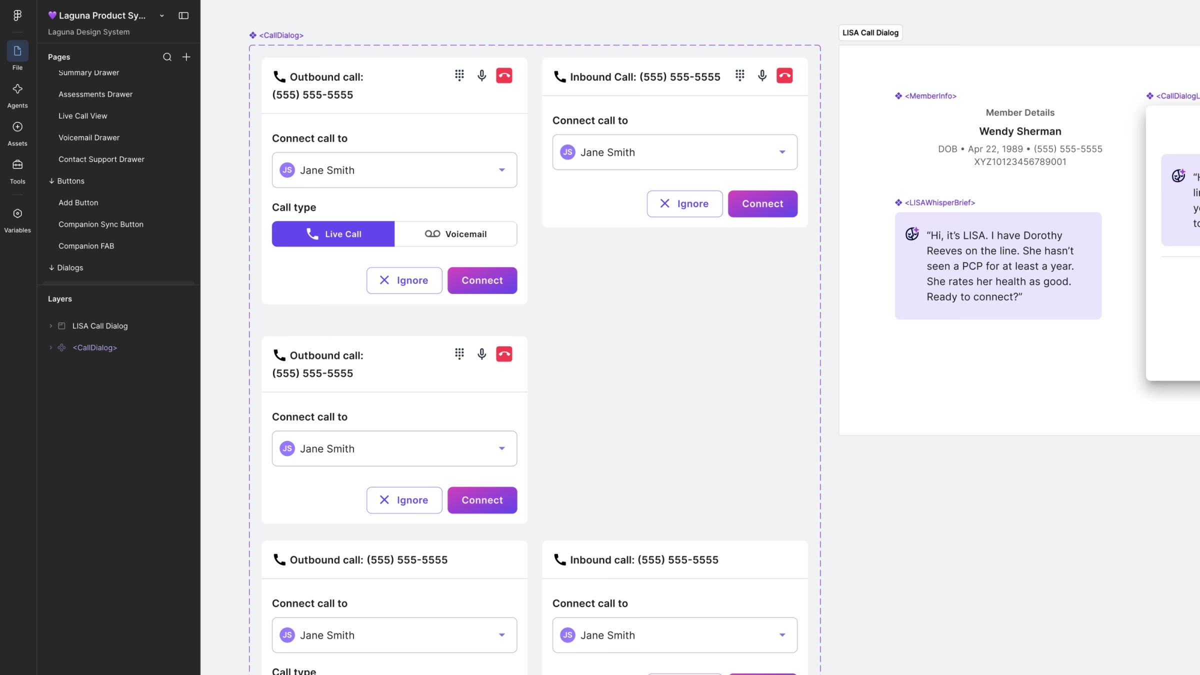
When I started on the product screens, Laguna’s components were scattered across different Figma files and pages. It was hard to find the latest version of anything, or to know whether we already had a component we could reuse for a new feature. All we had for a system was a small style guide for color and type.
A central Figma library
Together with the R&D team, I chose Material Design as our base and built one central library for all of our styles and components. Then, I added pages for custom components. It became the hub for product design: easier to find what already existed, easier to add new pieces, and a smoother handoff to engineers.
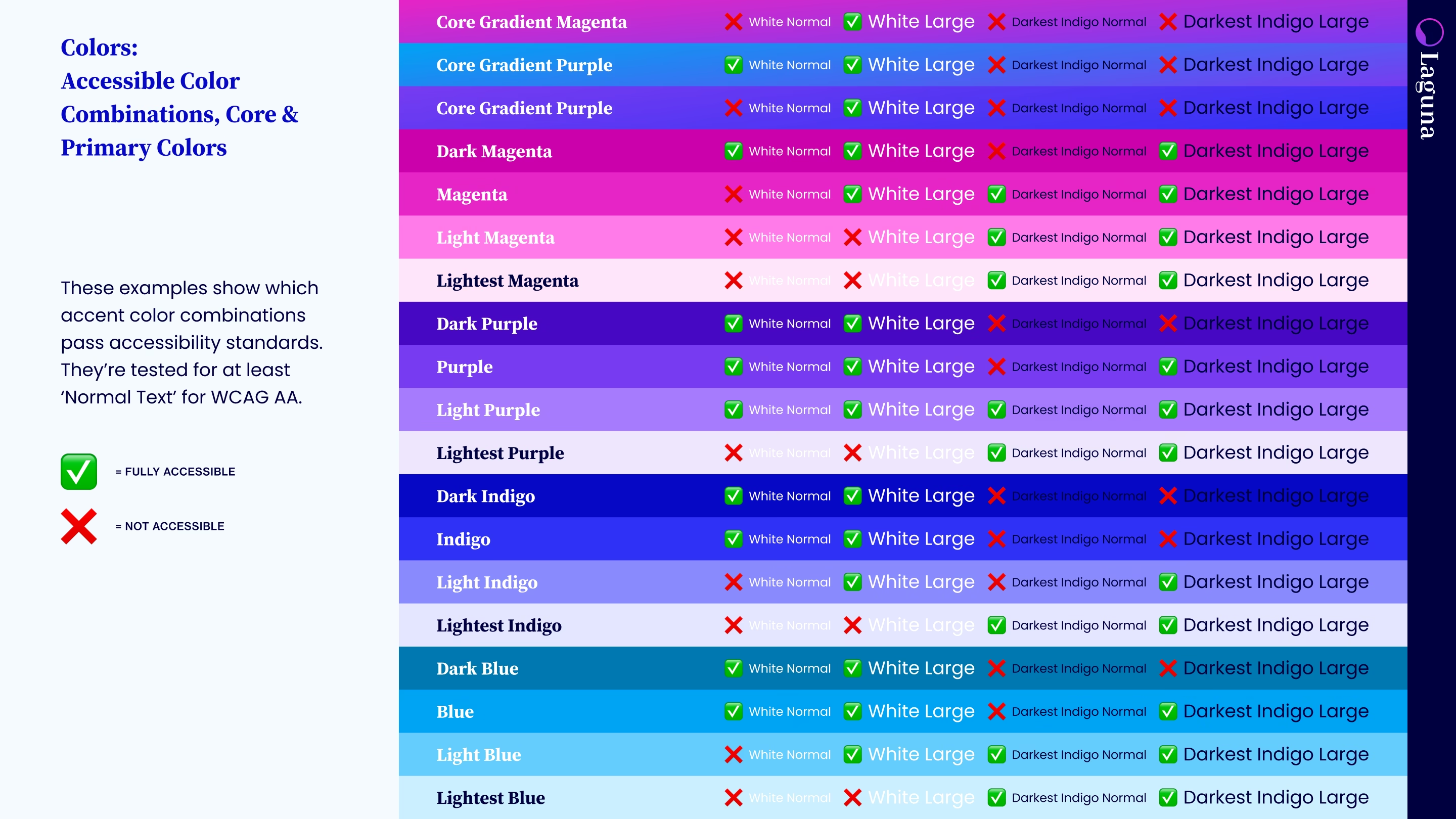
Bringing our brand into the product
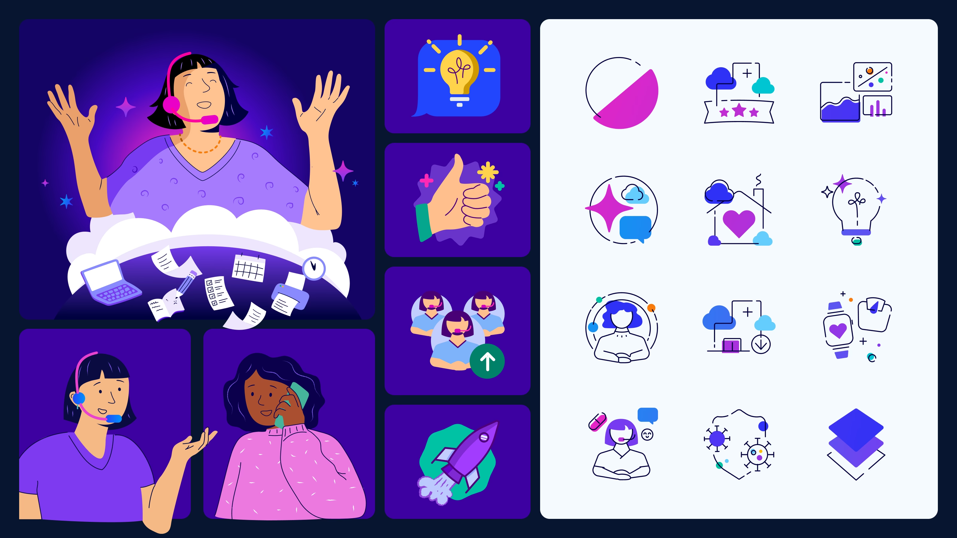
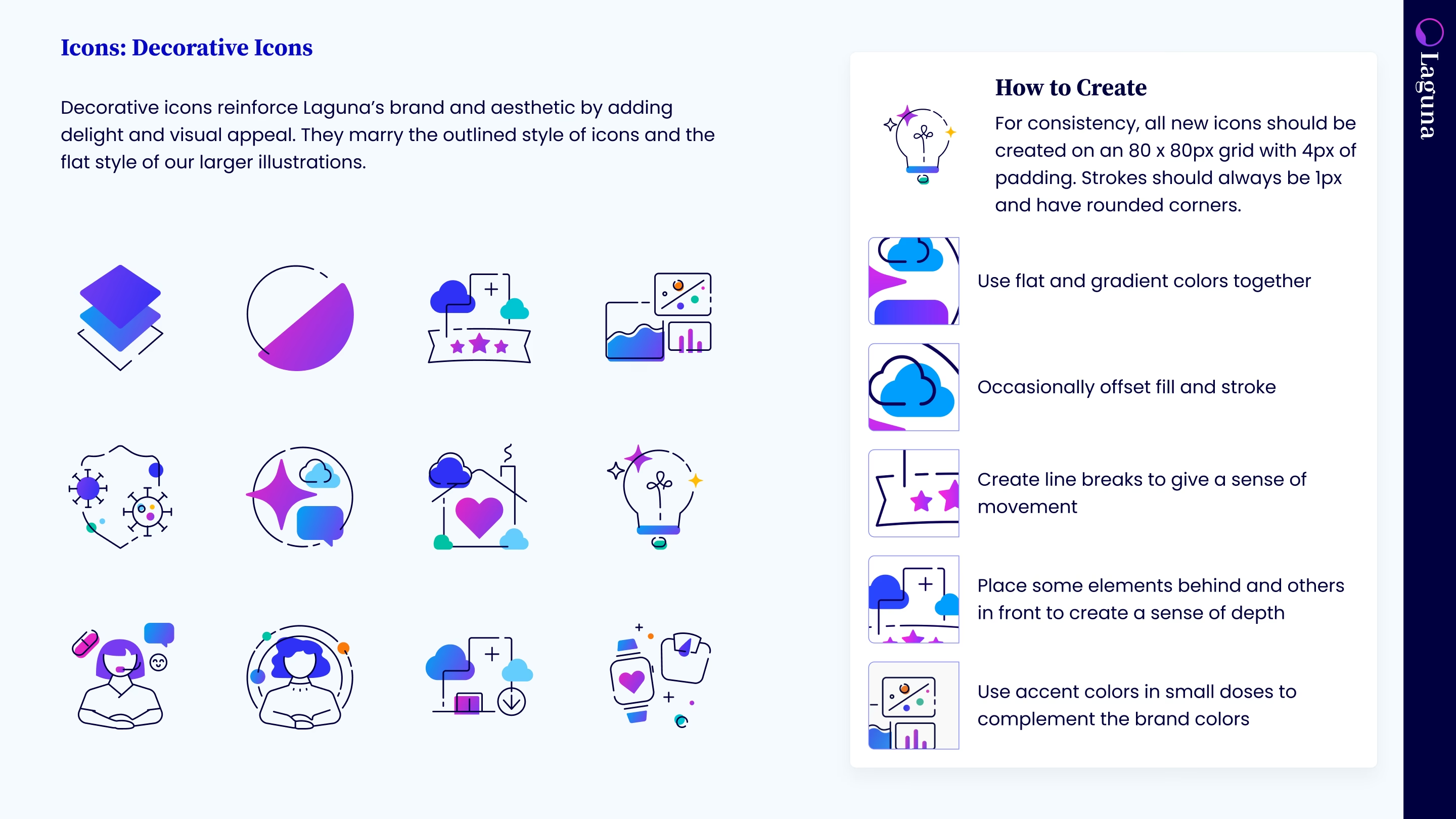
I brought our brand personality into the product, checking our brand colors for accessibility and incorporating those colors into our UI components. I also designed rules for creating icons and illustrations that would be unique to Laguna. These assets came in handy for both product and sales presentations.
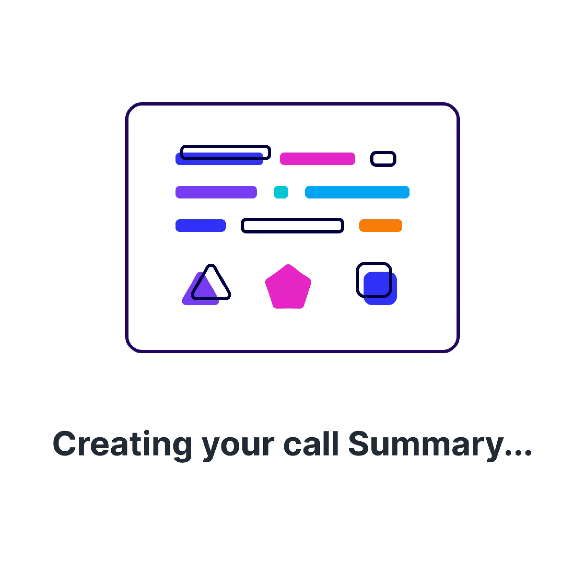
I also created animations for moments when the system is generating or loading something in order to provide user feedback and a moment of delight.

Final designs
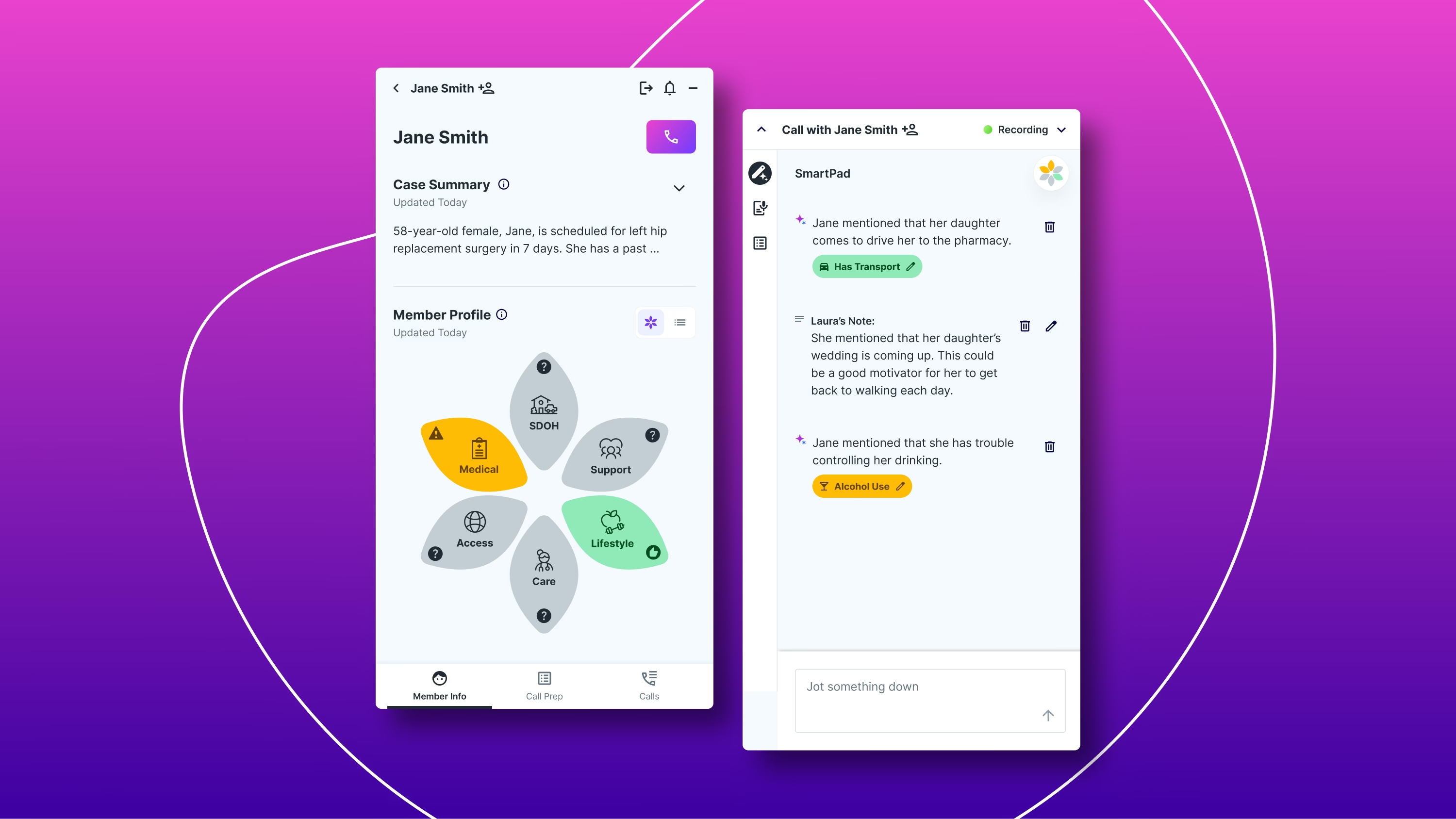
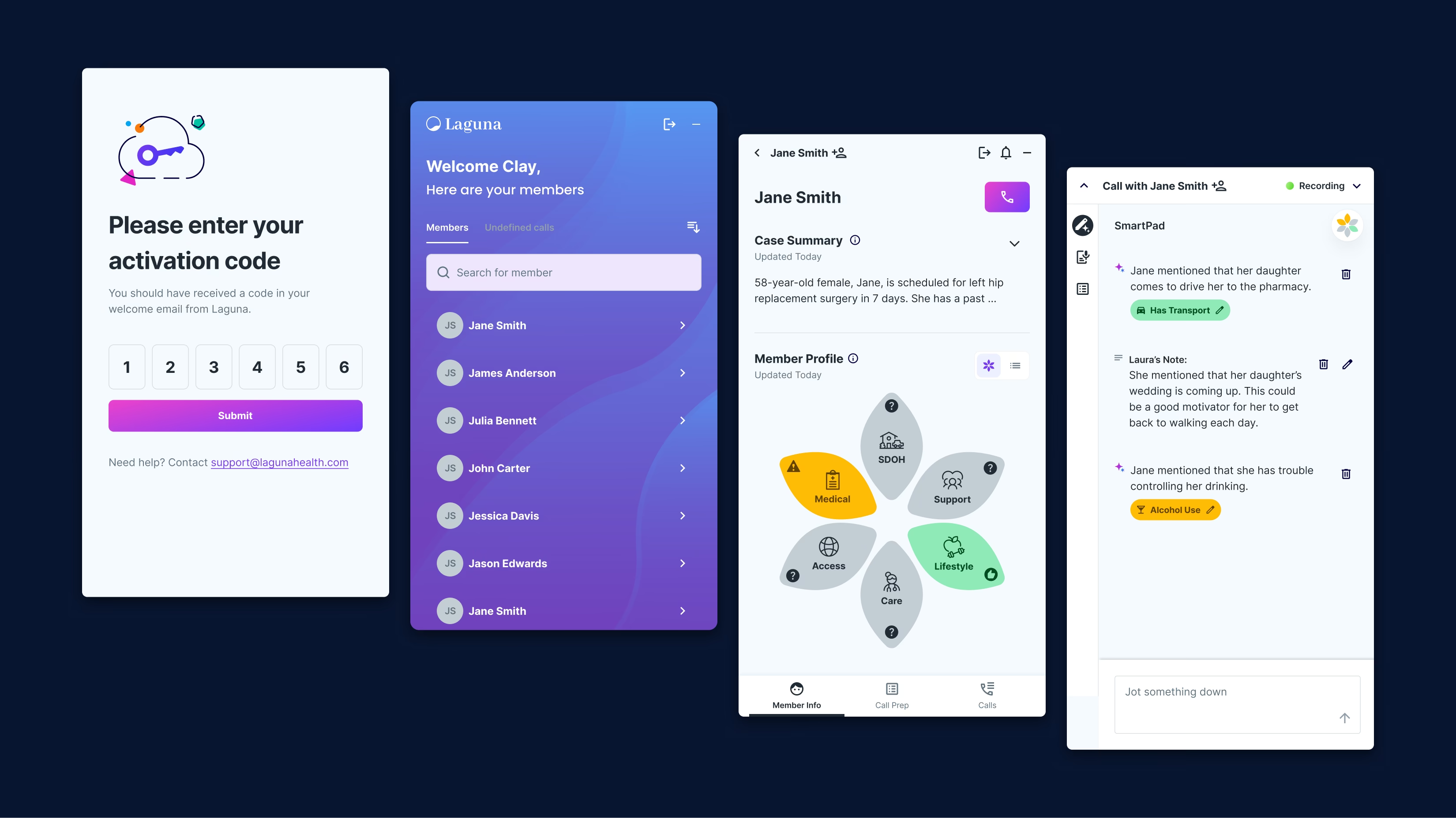
Call prep
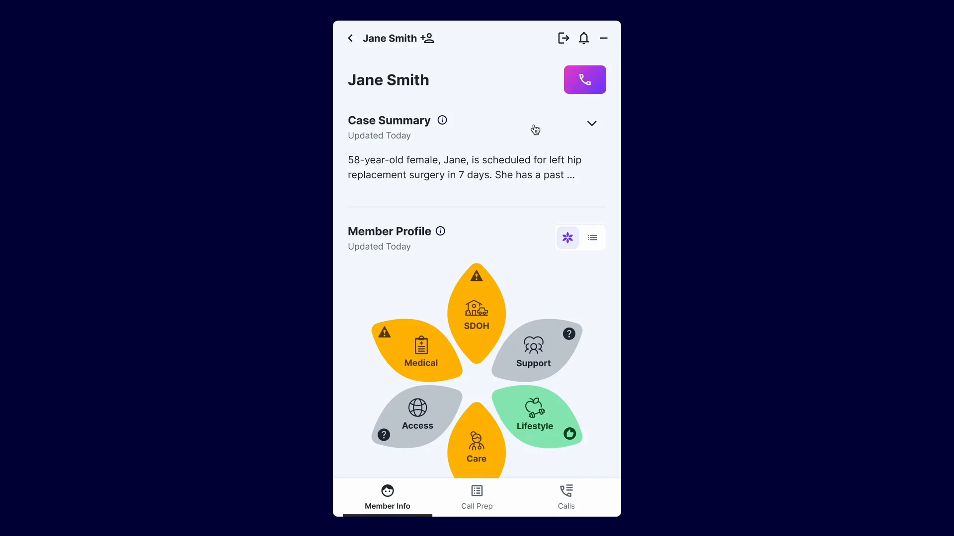
Before Laguna, case managers pieced together a member’s story from many different places. Call prep put it in one place they could glance at to get up to speed quickly.
- Case summaryA narrative, at-a-glance overview of the member’s case, updated automatically after every conversation. Testers reached for it first, so it moved to the top of the screen.
- IDOH FlowerA categorized view of the member’s traits that shows areas of risk, non-issues, and unknowns to guide the next conversation. After testing, I added labels and clearer status colors, plus a list view for anyone who preferred it.
- Suggested actionsTasks recommended for the next conversation, based on the last one. I removed their numbering after testers said it felt like the AI was telling them how to do their job.
Live call
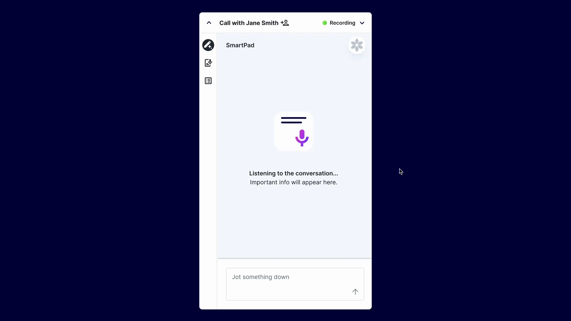
With so much to cover in a call, it’s easy to miss a key topic. The SmartPad sends gentle nudges when something comes up that should be addressed. Early versions showed too much at once, so I simplified the live view to the SmartPad alone, with the transcript and prep notes one click away.
The live transcript turned out to be more helpful than we expected: when a member had a strong accent or a speech impediment, or when a case manager just wanted to look back at what was said. It uncovered benefits of Laguna Companion we had underestimated.
Post-call
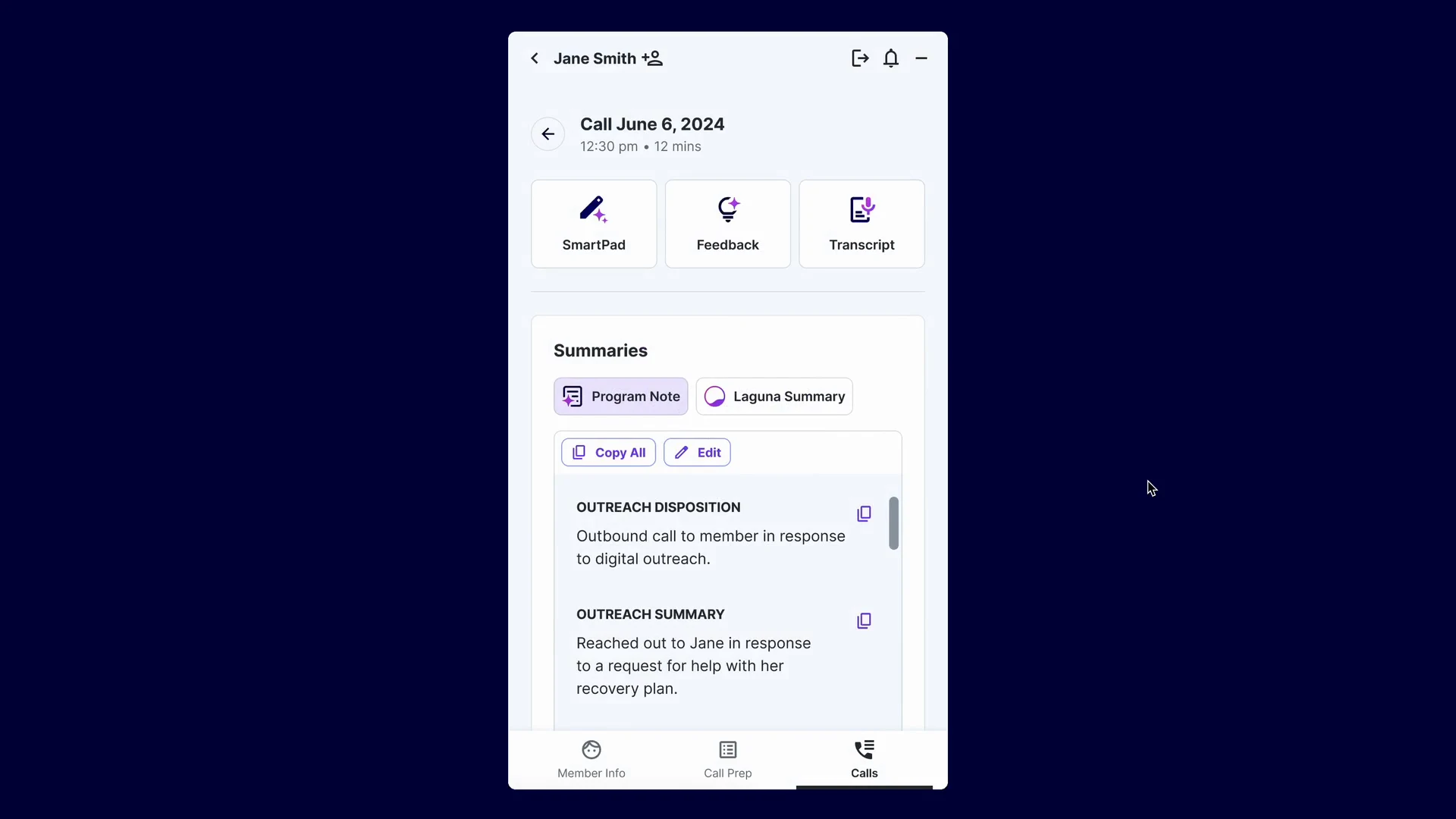
Before Laguna, documenting a call took about as long as the call itself, and feedback depended on a supervisor finding time to listen in. Post-call took care of both as soon as the case manager hung up.
- Post-call summaryA call note generated about a minute after the call, in a compliant format case managers could copy straight into their records. It was the biggest time saver in their workflow, and it kept getting faster: Laguna learned from the edits case managers made and adjusted the model over time.
- Post-call feedbackPersonalized feedback on each conversation, highlighting what went well and what to try next time. Supervisors rarely had time to listen to every call and coach each person, so this gave case managers a way to keep growing between those conversations.
Launching and learning on site
We launched in October 2024 with 5 champion users, then 22 more two weeks later. Staging the rollout let early adopters surface issues and become go-to resources for their teammates. The response was strong enough that the health plan invited us onsite.
In November, I spent three days shadowing case managers. A lot was working: they got up to speed quickly, the post-call notes were high quality, and they told me they felt more present with members. Post-call feedback was a standout.
“It’s my favorite screen. It’s like my cheerleader… even if it’s just an AI system, it’s my cheerleader and it keeps me going.”
I also saw what needed work. The case summary’s expanded view was hard to find, editing felt cramped next to the wide Word document they were used to, and our installation flow broke under the health plan’s strict IT policies.
Over the next few months, we shipped fixes: a wider editing mode that opens automatically, a case summary that starts expanded, an installation flow the health plan could manage, and versions of the post-call note tailored to each clinical team’s documentation style.
Results
From December 2024 to March 2025, the health plan ran its own time study and satisfaction survey across six clinical teams.
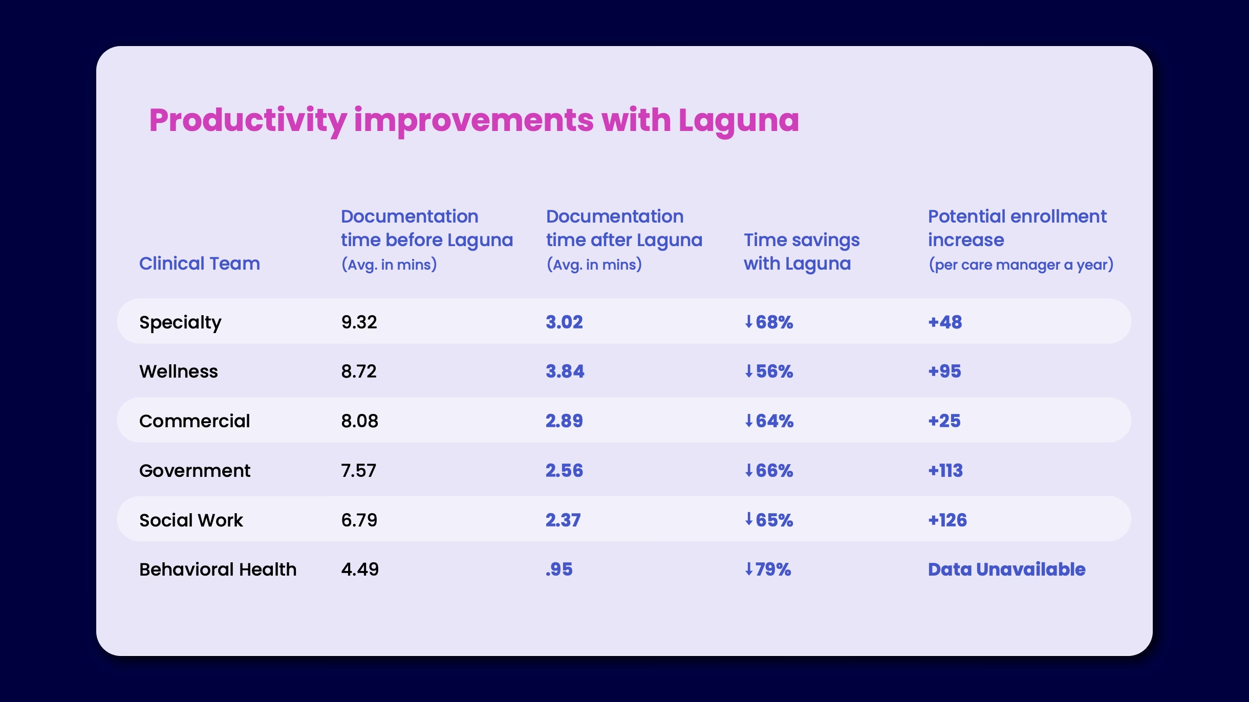
66%
less time on post-call documentation
+51%
satisfaction with documentation time
+96
enrollments per case manager per year
5 → 300
case managers in 14 months
By April and May 2025, with trust and process established, we trained four more cohorts, each going from training to live in a single day.
“Laguna has been amazing. It is actually a relief to have it on a busy day when you’re wondering how you will get through all of your calls. It’s truly my ‘work companion.’”
What I learned
- Good design isn’t enough if the AI content isn’t good.Every UX fundamental I’d relied on for a decade still applied, but none of it mattered if the summary missed the mark or the real-time nudges were noise instead of signal. That’s a different kind of design problem, and I learned it as we went.
- “Just make it a copilot” undersells how hard the mundane parts are.Getting a case manager to hit record at exactly the right moment, while introducing themselves and pulling up their CRM, took as much iteration as any headline feature, because getting it wrong broke trust in everything else.
- Deep customization built trust, but it came at a real cost.Tailoring the product to each team’s documentation needs set us apart and was a big part of why users loved it. It also asked a lot of our customer: several rounds of review to get to “good.” I still think about how to reach that bar with less upfront effort from the people we’re serving.