Helping people take cancer meds on time
Overview
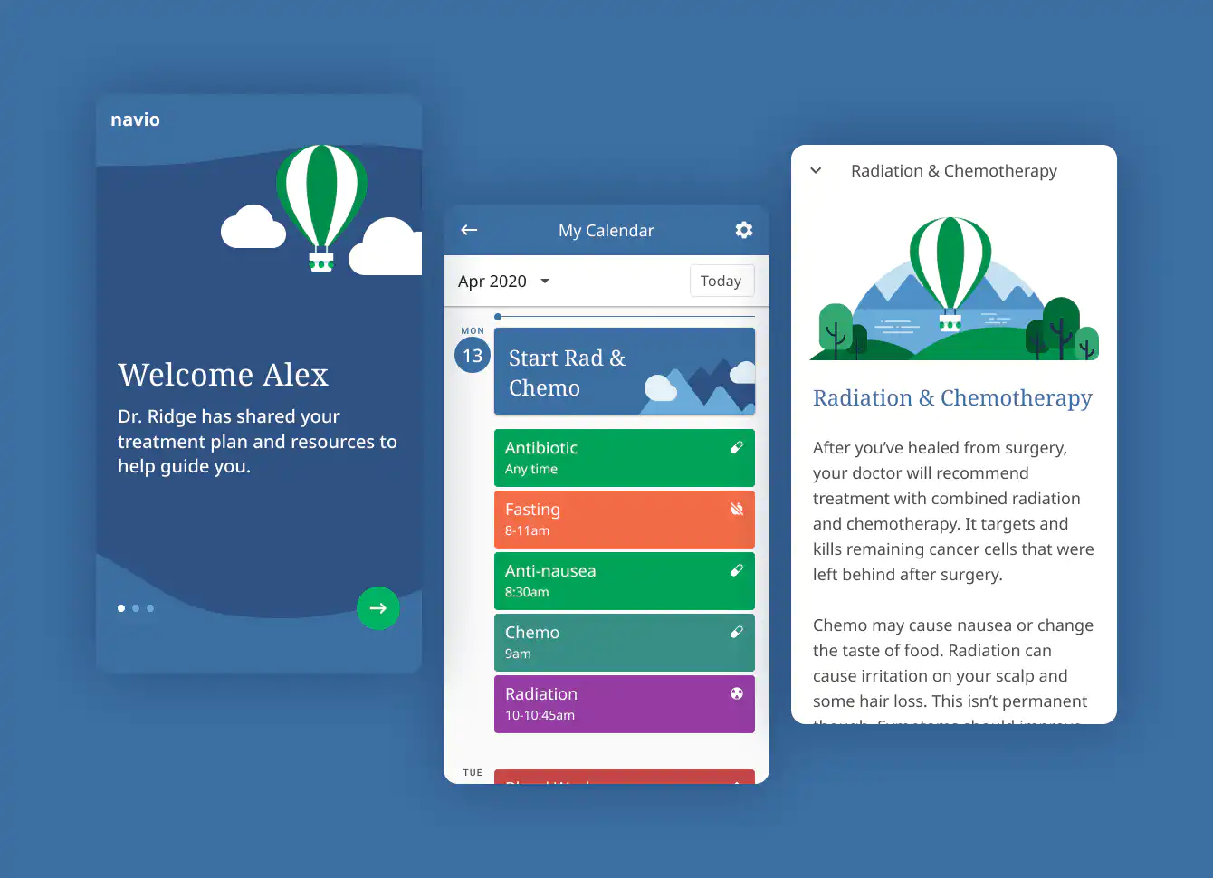
We designed the first release of Navio’s app to help brain cancer patients follow their doctor’s treatment plan. It included a calendar of key events (medications, labs, and MRIs), educational articles, and links to trusted resources.
Patients returned to the app over time, but their activity was mostly around the start of each treatment cycle.
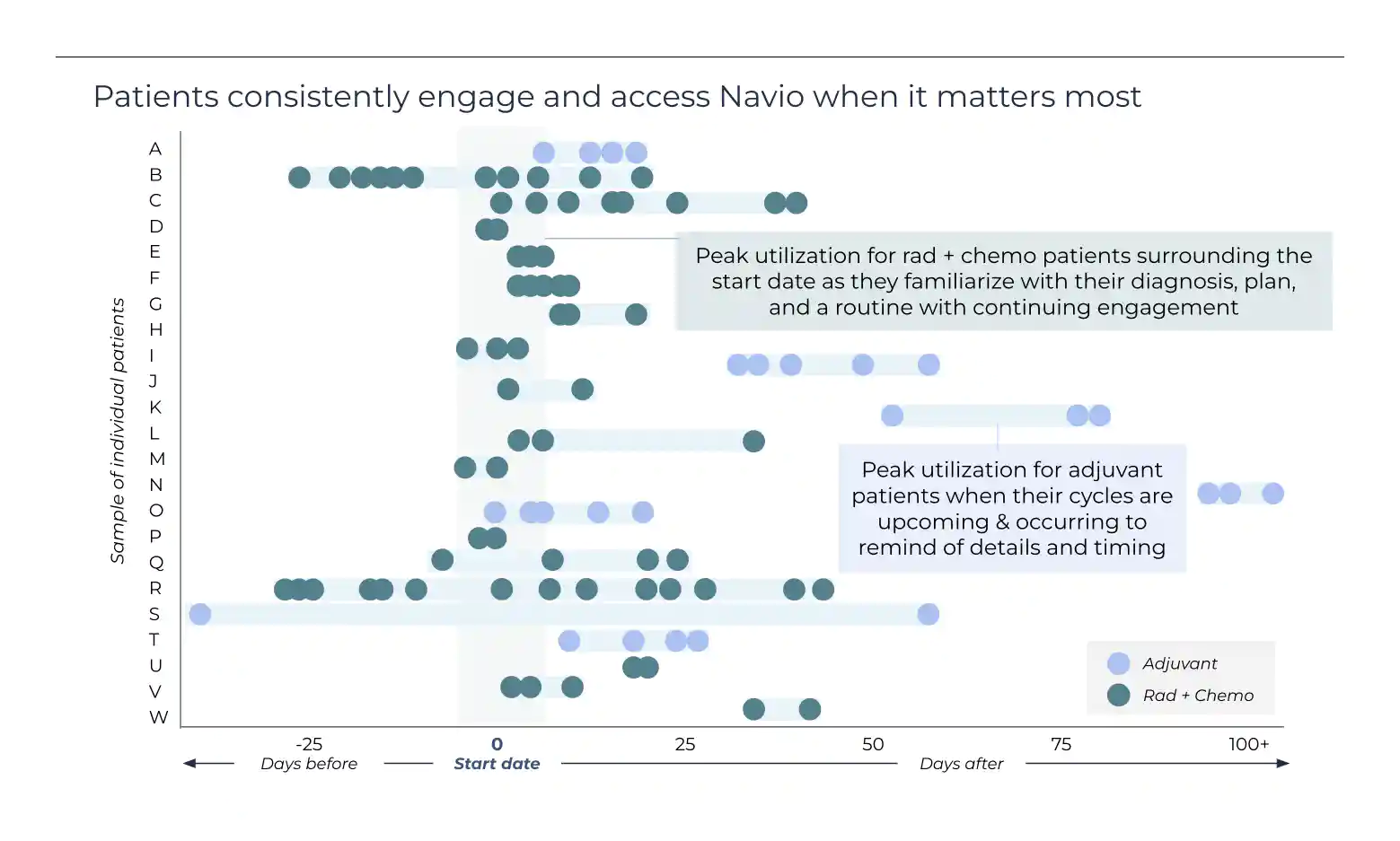
We were pleased to help patients prepare for treatment, but now we were asking ourselves:
How might we support patients during treatment, day to day?
We knew that medication adherence was a challenge. To understand the size and nature of the problem, we started with research and interviews.
The opportunity
Over the past two decades, oral cancer therapies have boomed. Instead of going into a clinic and sitting in a chair for hours to receive chemotherapy, patients can take their medications at home.
With convenience comes new challenges. Patients now have to remember to take each medication at the right time and know how to take it (the dose, with or without food, and so on), several times a day.
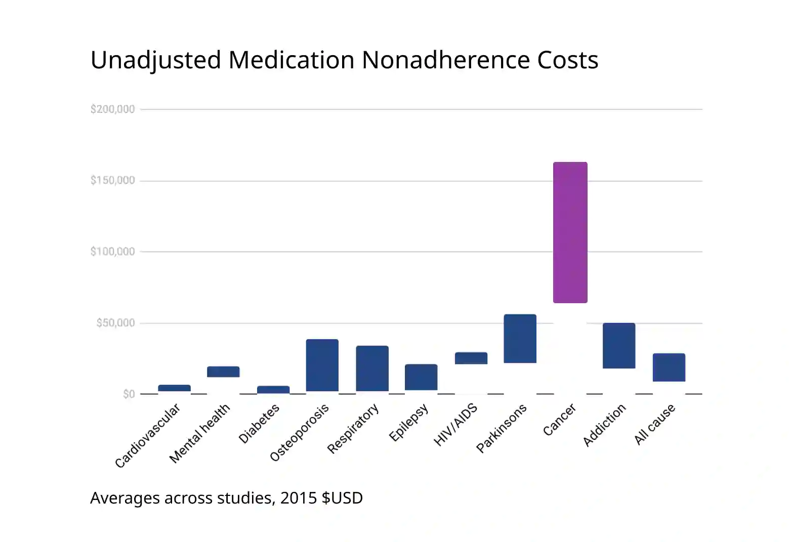
Study after study has shown that adherence to oral medications is surprisingly low, leading to less effective treatment, disease progression, more hospitalizations, and even death. Taken together, the cost of non-adherence in cancer has been estimated at $70,000 to $160,000 per person.
Contributing factors of non-adherence include:
- Lack of knowledge or experience at the start of treatment
- Memory and forgetting
- Side effects
- Complex treatment schedules that change
- Cost
Talking to patients and caregivers
From past conversations, we knew that caregivers played a key role in managing brain cancer treatment, because of the mental and physical challenges patients face.
At the same time, we planned to expand Navio’s support beyond brain cancer, so we talked with patients and caregivers across various diagnoses about how they manage their medications.
What we learned
- People commonly use physical checklists, a shot glass filled with pills for later, pillboxes, and phone alarms to remind them to take their medications.
- Even with reminders, they still sometimes forget.
- Even when they have taken their medications, they often can’t remember later which doses they already took, and they can get confused.
Objective
Help patients take their medications on time and confirm whether they’d taken earlier ones.
As a product team, we had a lot of evidence that text messages work well as reminders. Given this, we wanted to design a seamless flow, starting with a timely reminder and ending with an easy way to log what had been taken.
We’d design:
- Reminders by text message
- A simple way to log when medications are taken
- An easy way to look back at earlier doses
- Helpful information about each medication and how to take it
Lightning demos and sketching
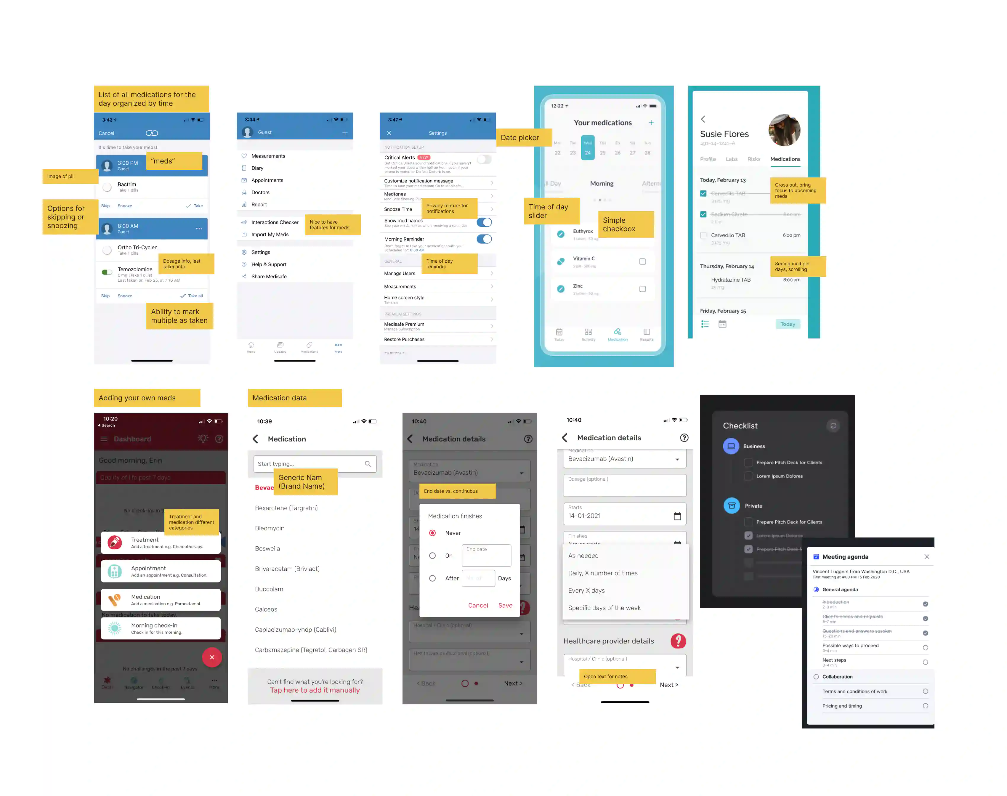
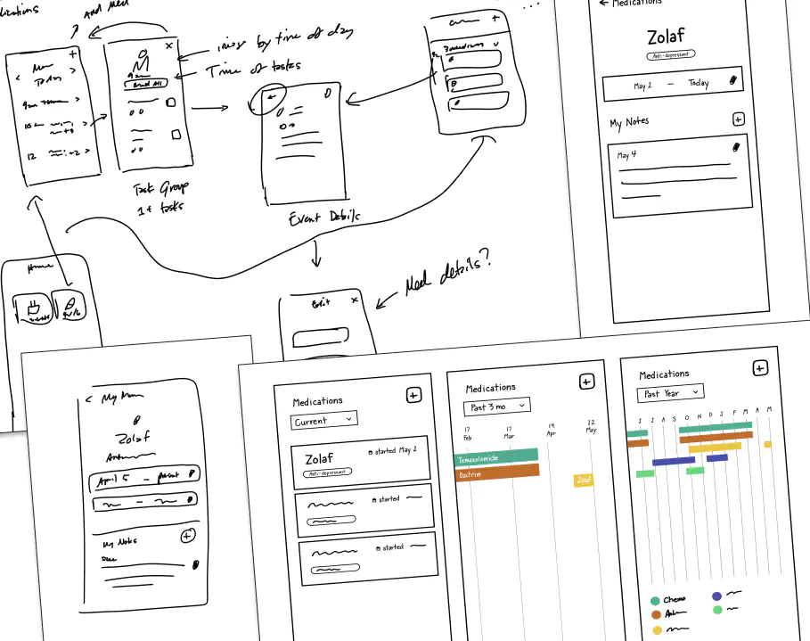
I was excited to have my friend and colleague from Vim, Tammy, as the lead designer on this feature. We started by sharing lightning demos of existing medication and task management apps. Tammy also tested a few and shared her observations with me. Then we sketched and discussed ideas for the design.
Prototyping and testing
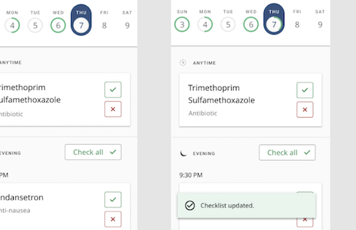
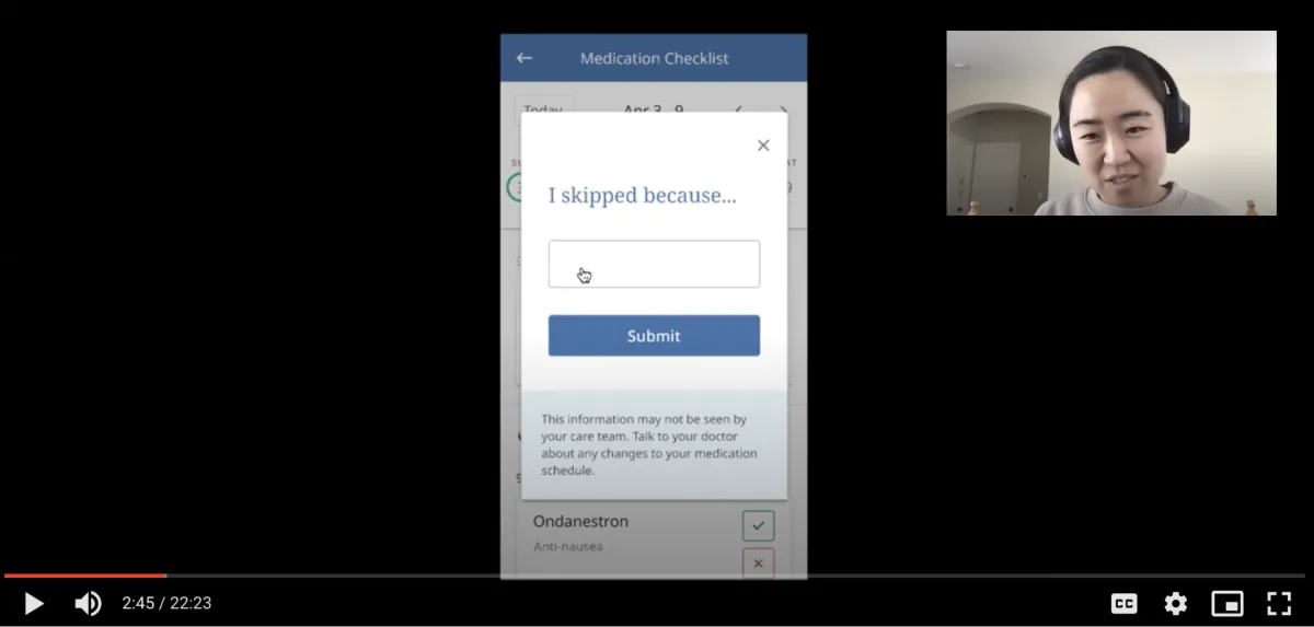
We created an interactive prototype and tested task-based scenarios with patients and caregivers. We asked participants to:
- Mark a single medication as taken
- Mark a group of medications as taken
- Mark a medication as skipped and log a reason
- Move between days
I wanted to share what we learned with the broader Navio team at our next all-hands meeting. To help my colleagues empathize with users, I sketched a few personas based on our participants.
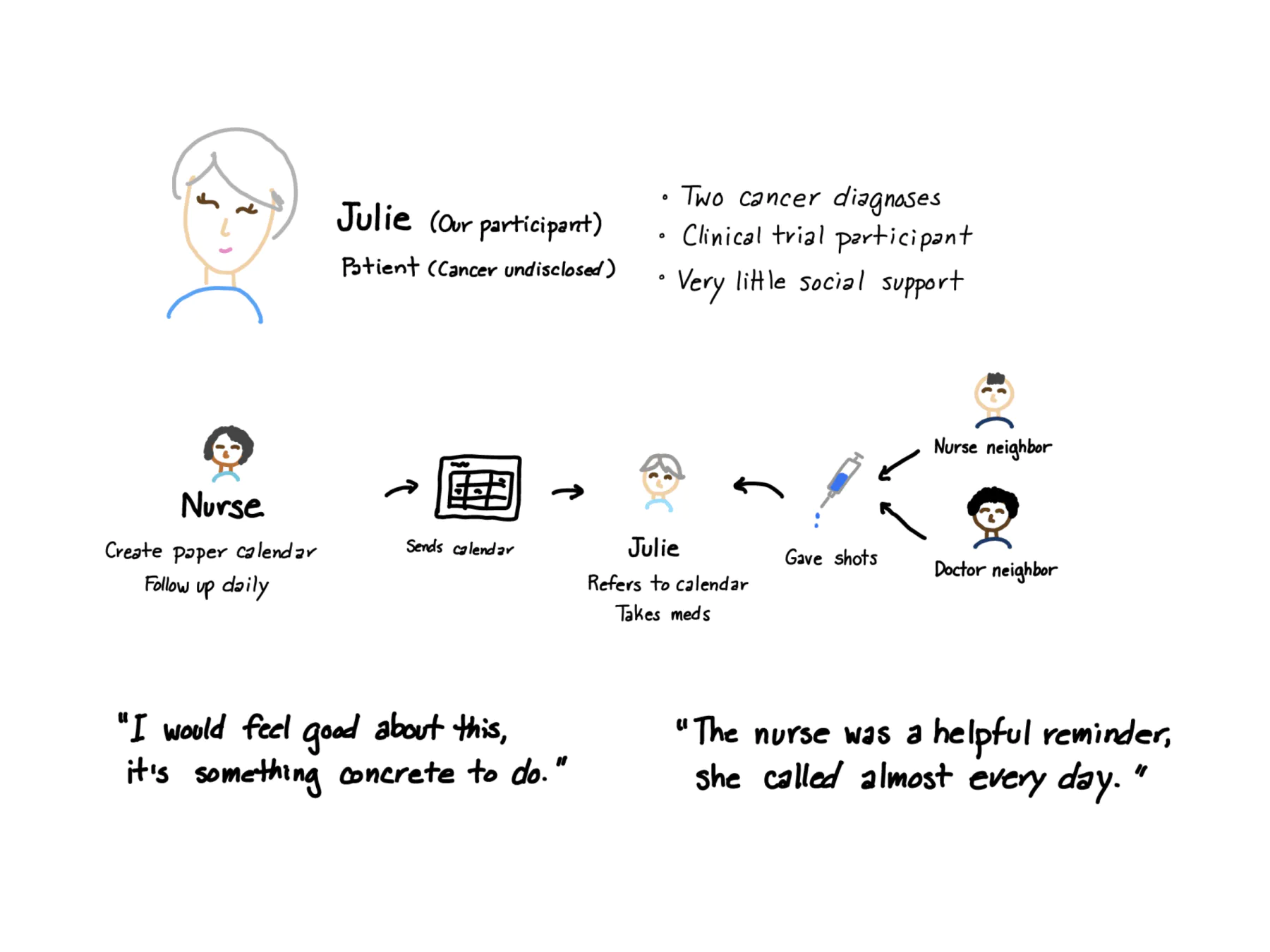
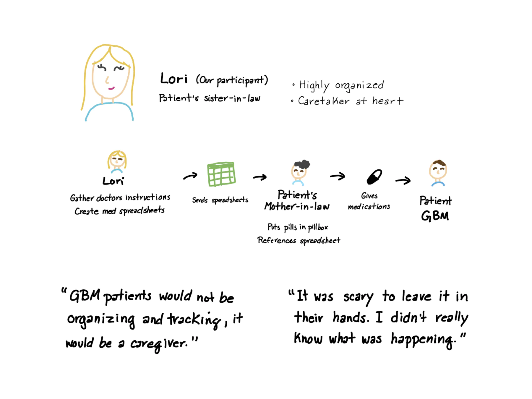
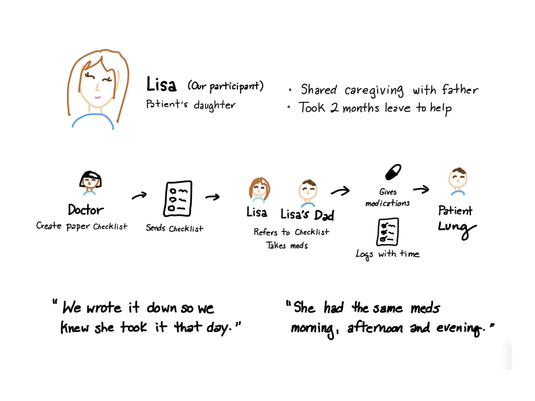
Key takeaways
- There’s too much dense information, and it feels overwhelming.
- The text is too small.
- It needs to be simpler, especially for people who may have cognitive difficulties.
- Most people would just check off the current medication, not look ahead.
- People wouldn’t log skipped doses or enter a reason, unless a doctor asked them to.
- Checking something off feels good, like you’ve accomplished something, even something small.
- A reminder could be very helpful.
- Reminders by text message felt important and less likely to be ignored than an alarm or push notification.
- It could help to look back at earlier medications to confirm they were taken, but only for the current day.
Design iteration
After testing with cancer patients and caregivers, we also interviewed internal stakeholders for feedback. It became clear that our next iteration needed to:
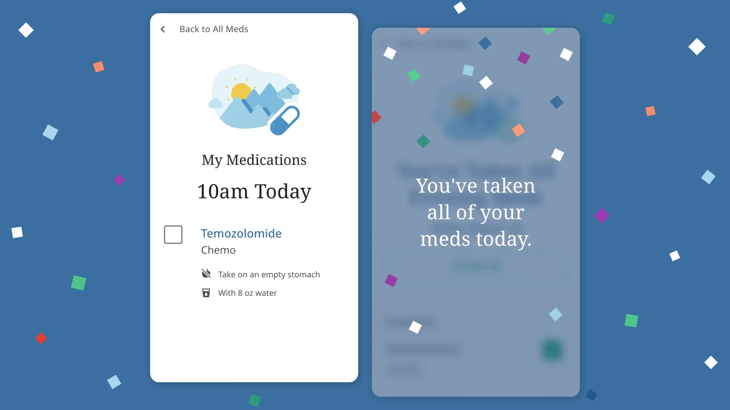
- Simplify the layoutMake each view less dense, and focus on one thing at a time: the current medication to check off, on the current day.
- Make everything biggerLarger text, icons, and imagery.
- DescopeNo skipping or logging reasons. Focus on what needs to be done right now.
- Add delightNavio’s design approach includes moments of delight and personality where they fit, so we looked for ways to bring a little joy to an otherwise tedious task.
Tammy and I challenged ourselves to “subtract until it breaks,” a principle I always come back to.
Working together at Vim, I’d seen what a great illustrator Tammy was. I asked if she could take some elements from the journey illustrations I’d created and expand on them here.
Our next round of designs was more focused, simpler, and more visually compelling.
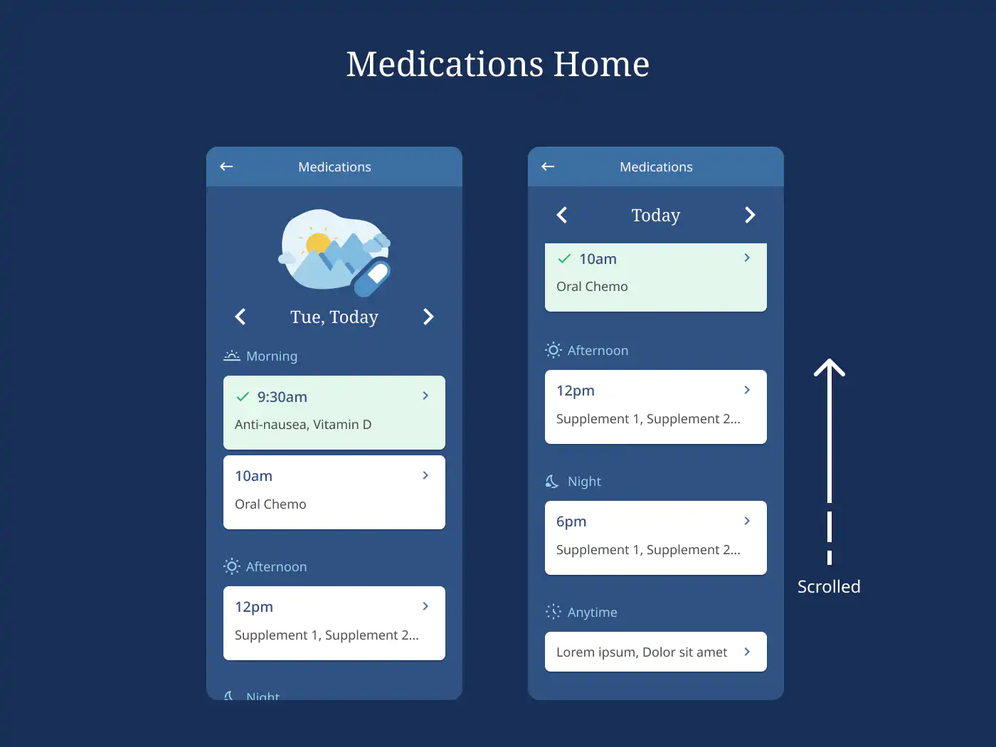
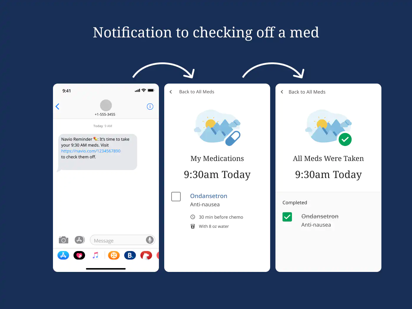
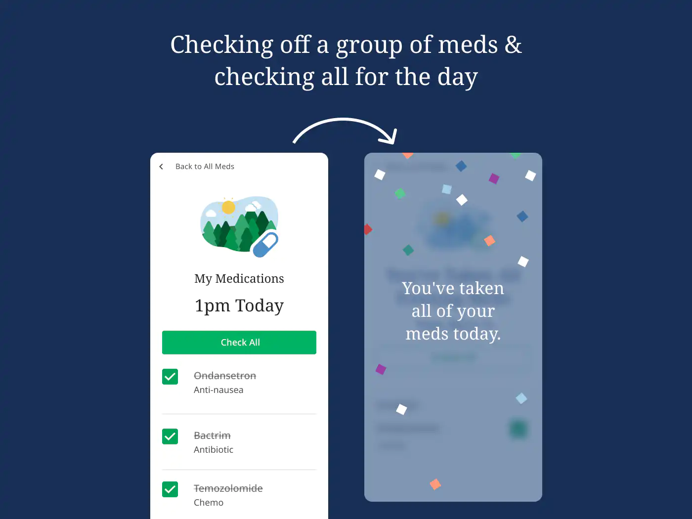
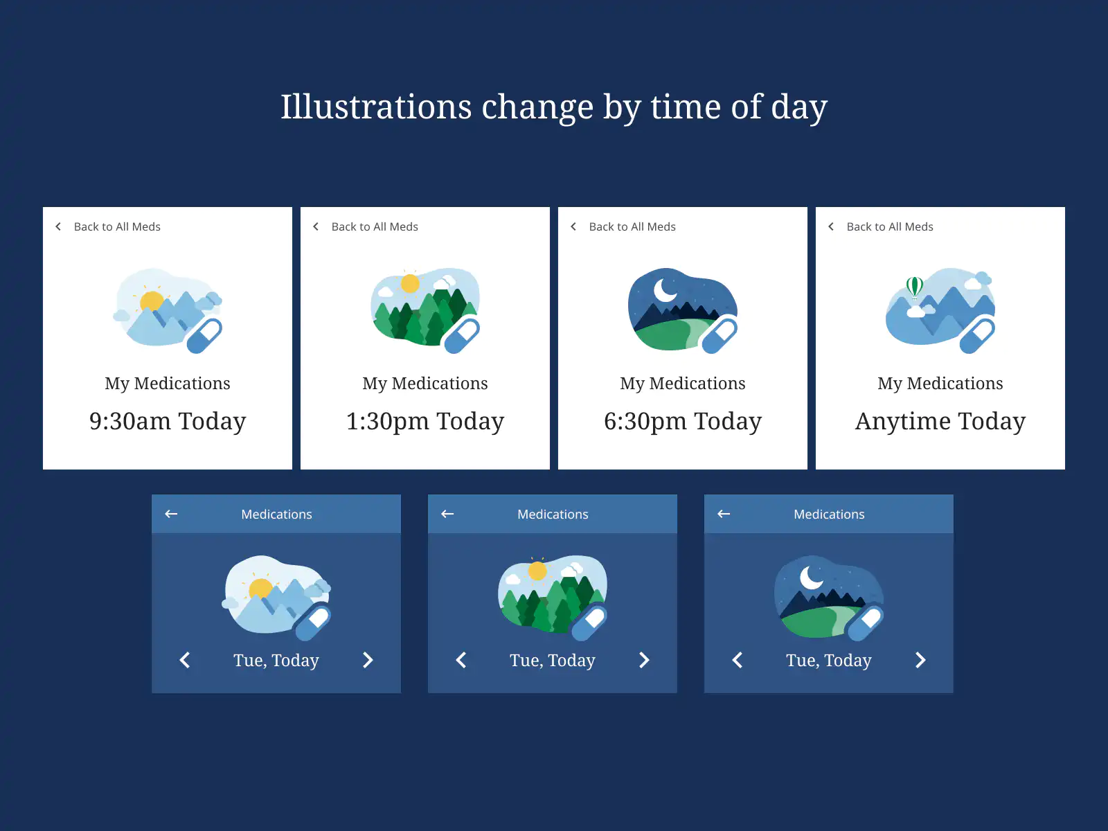
We tested these designs with some of the participants from our first round. They found them easy to understand and liked how quickly they could check off their medications.
We also reviewed them with internal stakeholders and made a few adjustments before preparing the handoff to engineering.
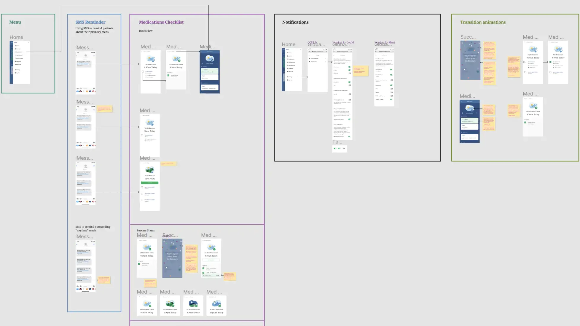
Handoff to engineering
Once we’d completed the discovery and design phases, we were ready to prepare the handoff.
It’s a crucial step in the design process. It helps make sure every detail is understood and built, and it shows you’re a good partner to the people building your designs.
We showed every state of the app and its components, made notes about transitions and interactions, and prepared graphic assets optimized for export.
Results
We launched the medication checklist as part of an internal study of how well our reminders and checklist improved medication adherence. Among participants who gave feedback:
100%
said Navio’s texts helped them remember to take their medications
92%
said Navio’s checklist helped them remember which medications they’d taken
Several participants asked to keep receiving reminders after the study ended.
The medication checklist has become a key feature of Navio’s treatment support for patients.