Designing a healthcare brand with heart
From BookMD to Vim
Vim started out as BookMD, a company that helped patients book imaging appointments faster while saving money on out-of-pocket costs.
I came on as the first designer and fourth team member. Over the four years I was there, we launched products for patients and providers, rebranded, grew the team significantly, and raised two rounds of funding. I built Vim’s brand system: its name, its logo, its illustration style, and how it showed up in the product, campaigns, sales story, and our offices.
A new name
By 2017, the company was looking beyond appointment booking, and the name “BookMD” was too narrow. So we started on a journey to find a new name with:
- FlexibilityOur name shouldn’t pigeonhole us.
- SimplicityIt should be easy to say and easy to remember.
- OriginalityWe needed to stand out in a fast-growing market of health tech companies.
I pitched “Vim,” as in “vim and vigor.” The concept was flexible, the word was short and easy to remember, and it had a unique quality, since it’s not often used today. It represented the energy of our team and the good health we wished for our customers.
A new logo
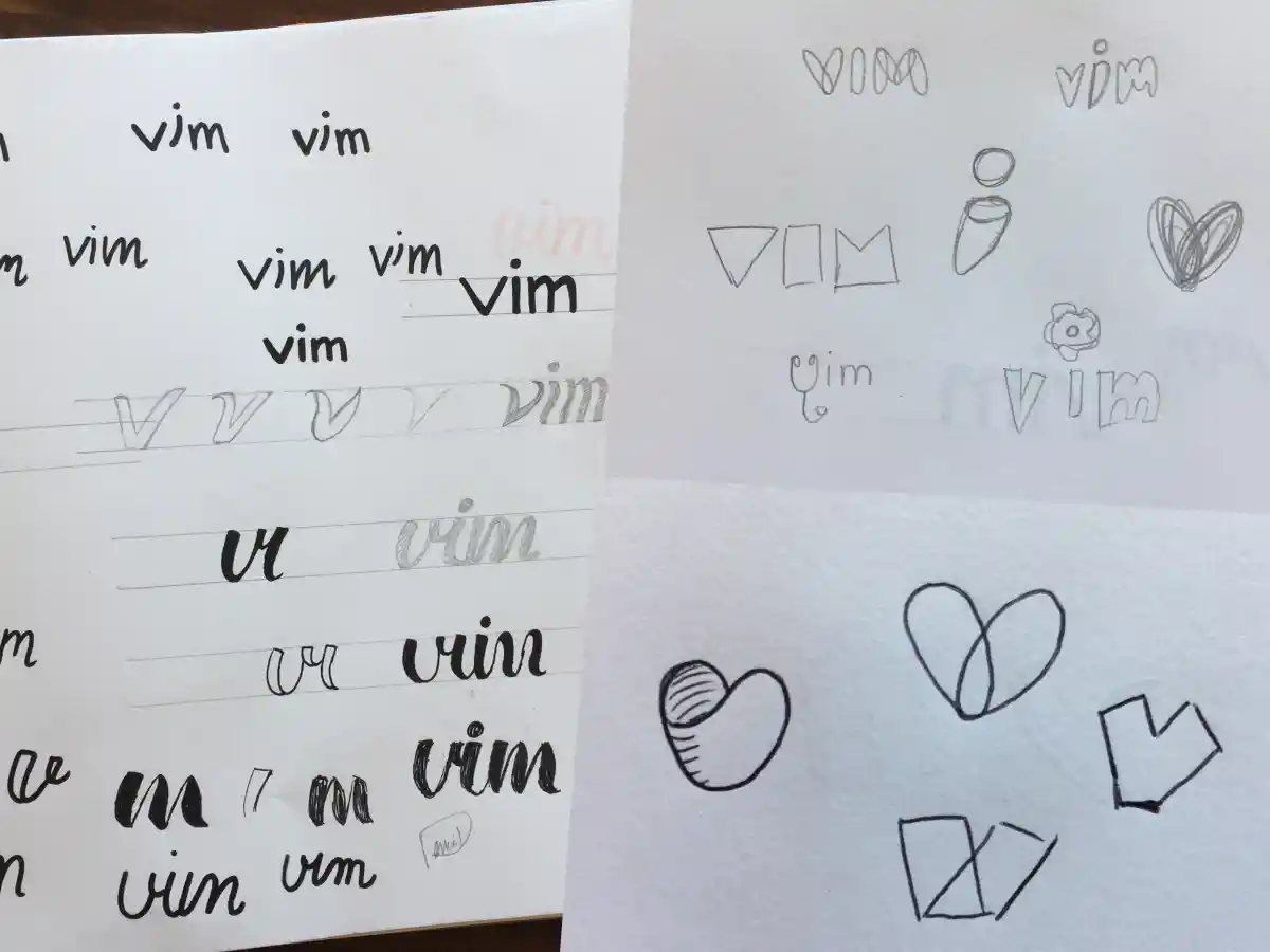
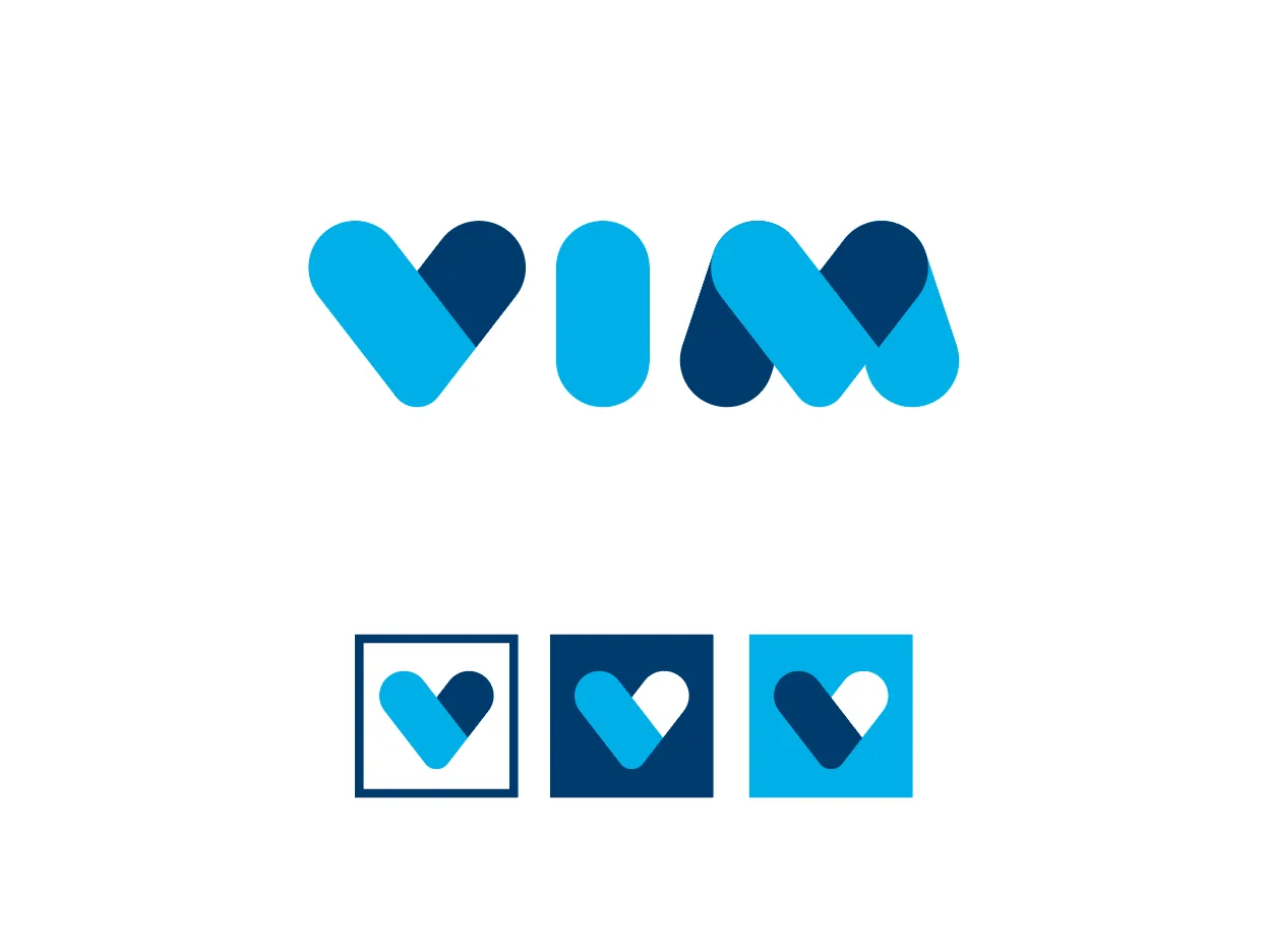
Now that we had a name befitting Vim’s ambitions, we needed a logo to match. I started exploring the “v” heart and how its shapes could extend to the other letters in the word.
I used simple shapes to show how they come together to make a whole, much as Vim connects systems to give customers a seamless experience. Once I had the form, I thickened the shapes so the word would take up as much space as possible, so it reads well even when it’s small.
An illustration style
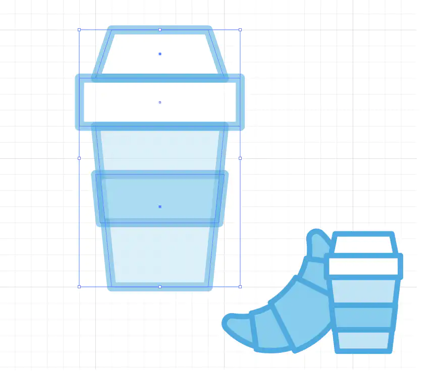
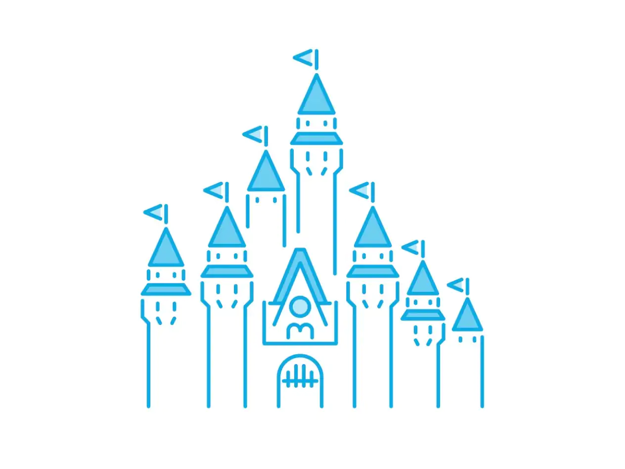
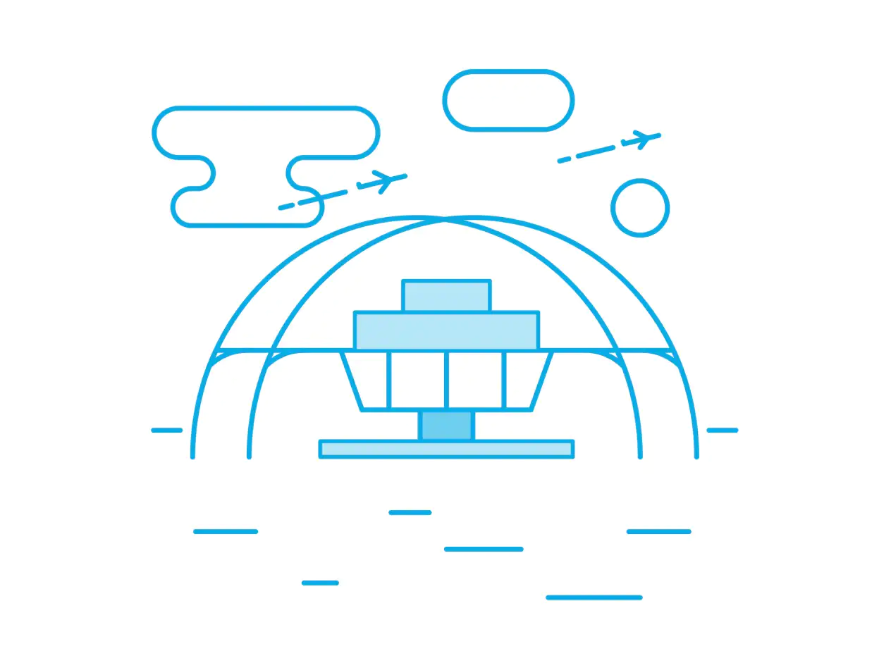
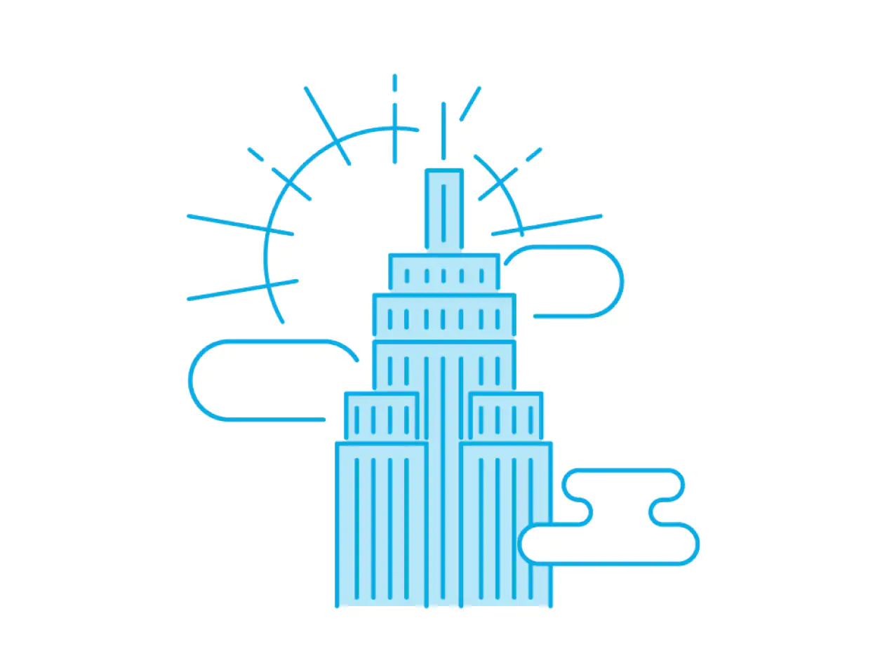
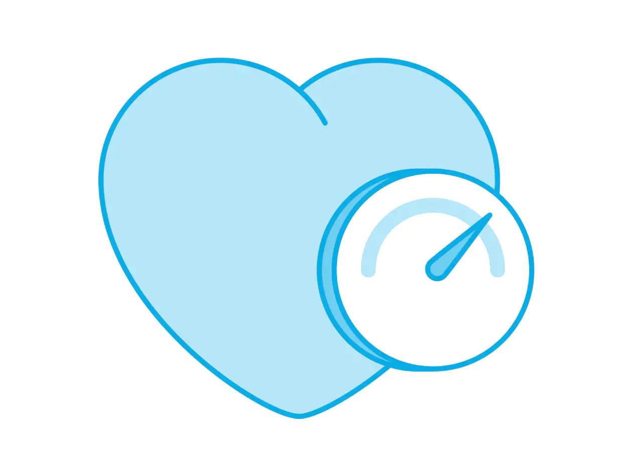
I set guidelines for creating line art illustrations: geometric shapes, aligned to a grid, so all of our imagery had a consistent look and feel.
Illustration became a key part of our design system, and it shaped our company culture.

The brand in the product
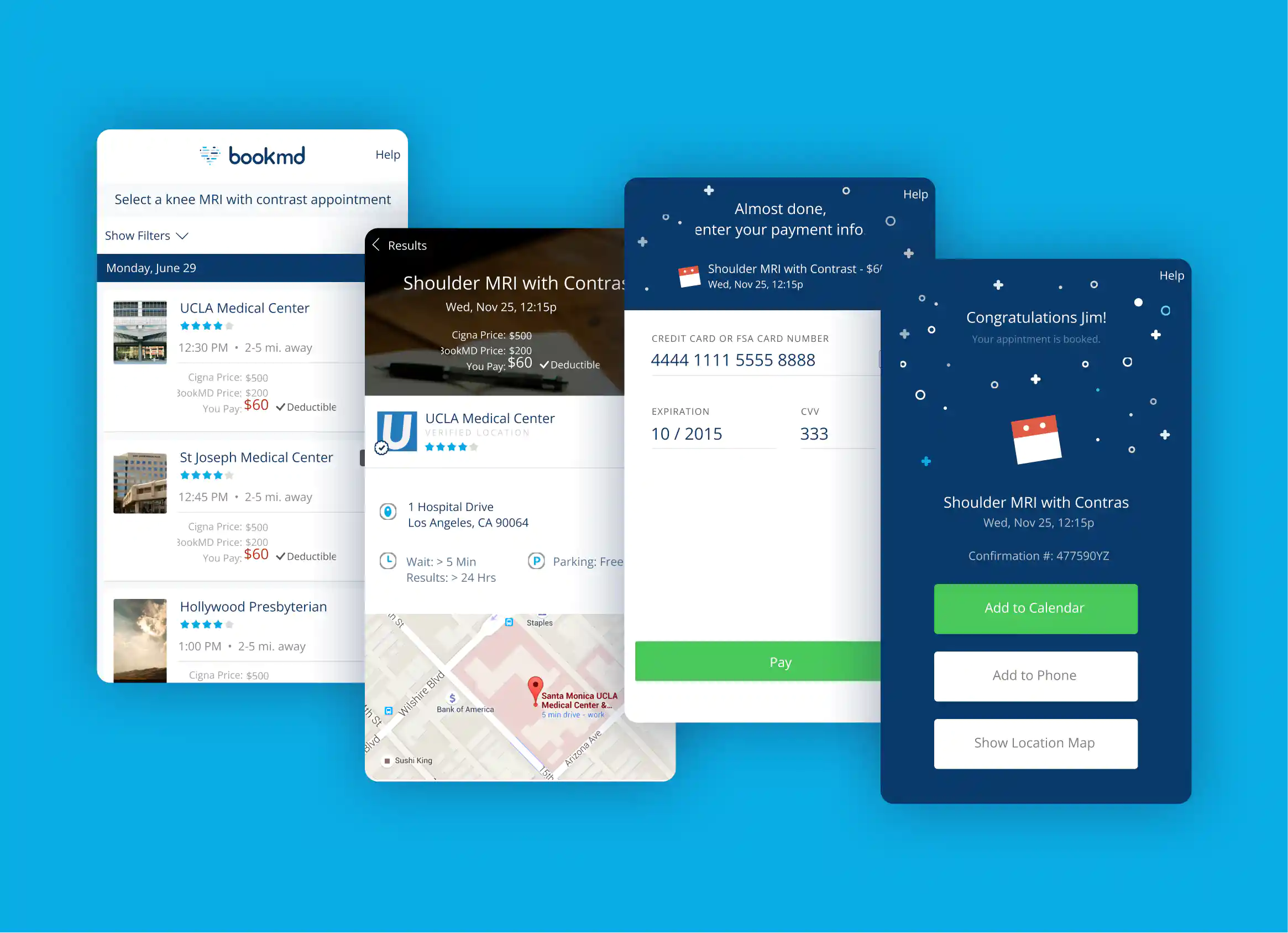
Our patient and provider tools were where most people met the brand, so the brand had to work there first. Three principles guided how it showed up in the product:
- Mobile first
Our patient and provider tools were web apps. I knew responsive design well from my years in ecommerce, so I took a mobile-first approach to make sure the apps worked well on every device.
- Accessible
I had learned accessibility best practices from a product leader at PayPal, and applied them in this role. That came in handy when insurers were vetting our app.
- Joyful
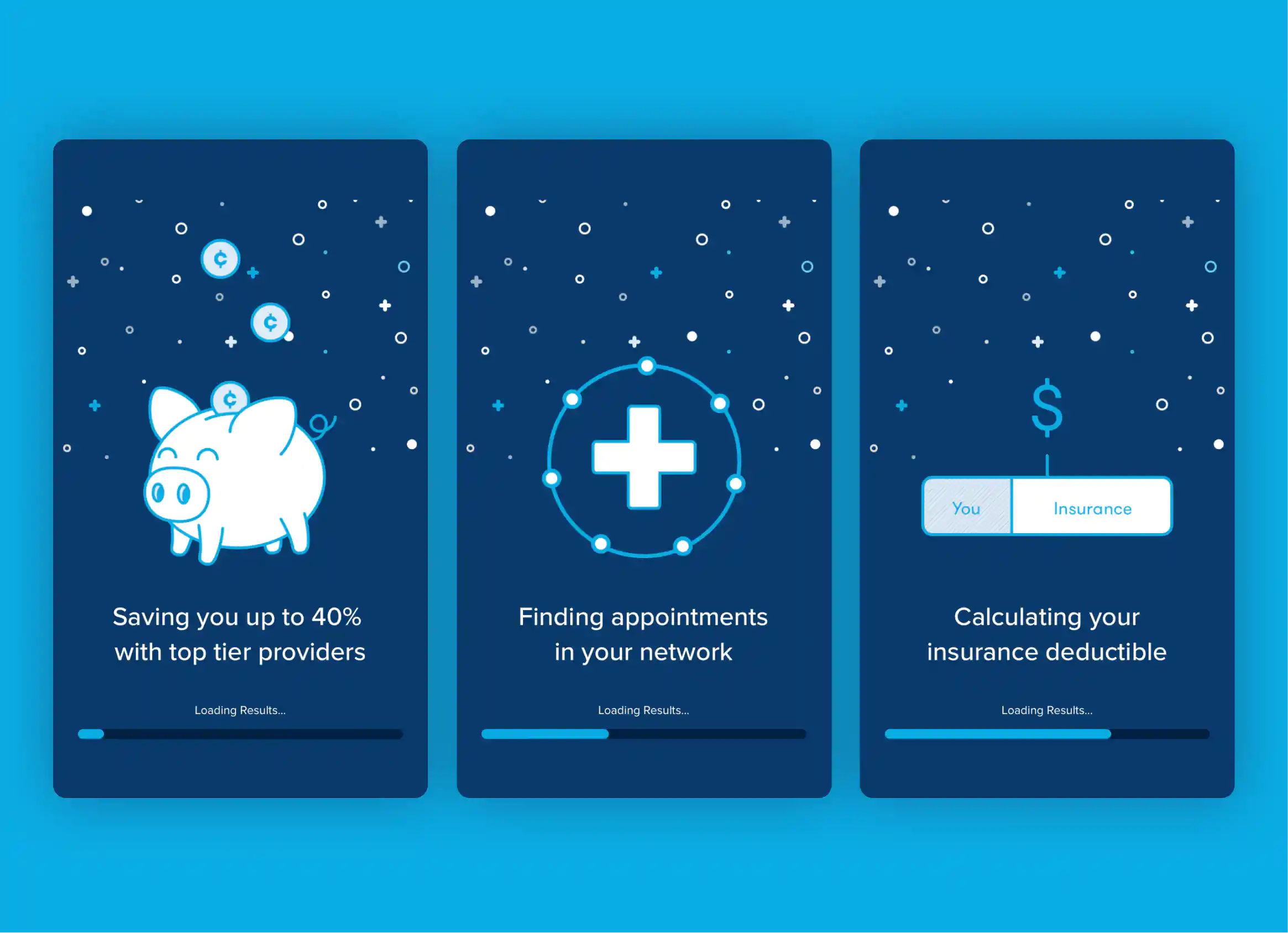
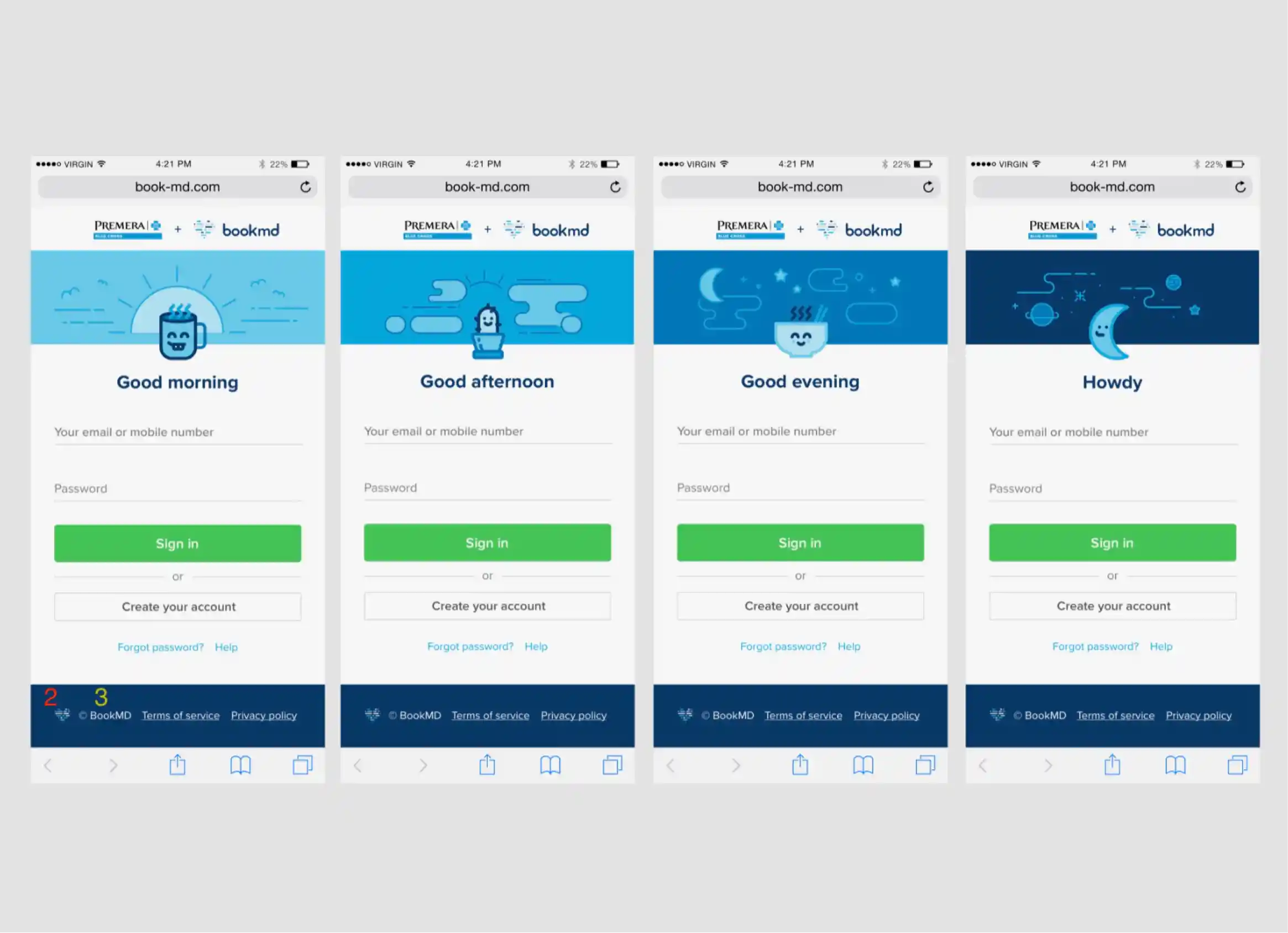
Our Head of Product, Yael, was a wonderful partner who always considered our users’ emotional state and motivation. Together we gave the experience humanity and joy, with friendly copy and the illustrations carried into loading and sign-in screens.
Campaigns
Our first commercial partner was Disney, a self-funded employer who wanted employees healthy while saving on the cost of care.
Mammogram campaign
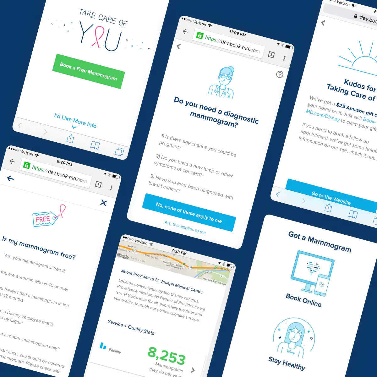
Disney asked us to raise the number of employees getting preventive mammograms with a targeted campaign. They provided a list of eligible employees, and we handled outreach, booking, rewards, and reporting.
Yael and I wrote the slogan “Take Care of You,” and I designed its type treatment, the digital experience, and tote bags.
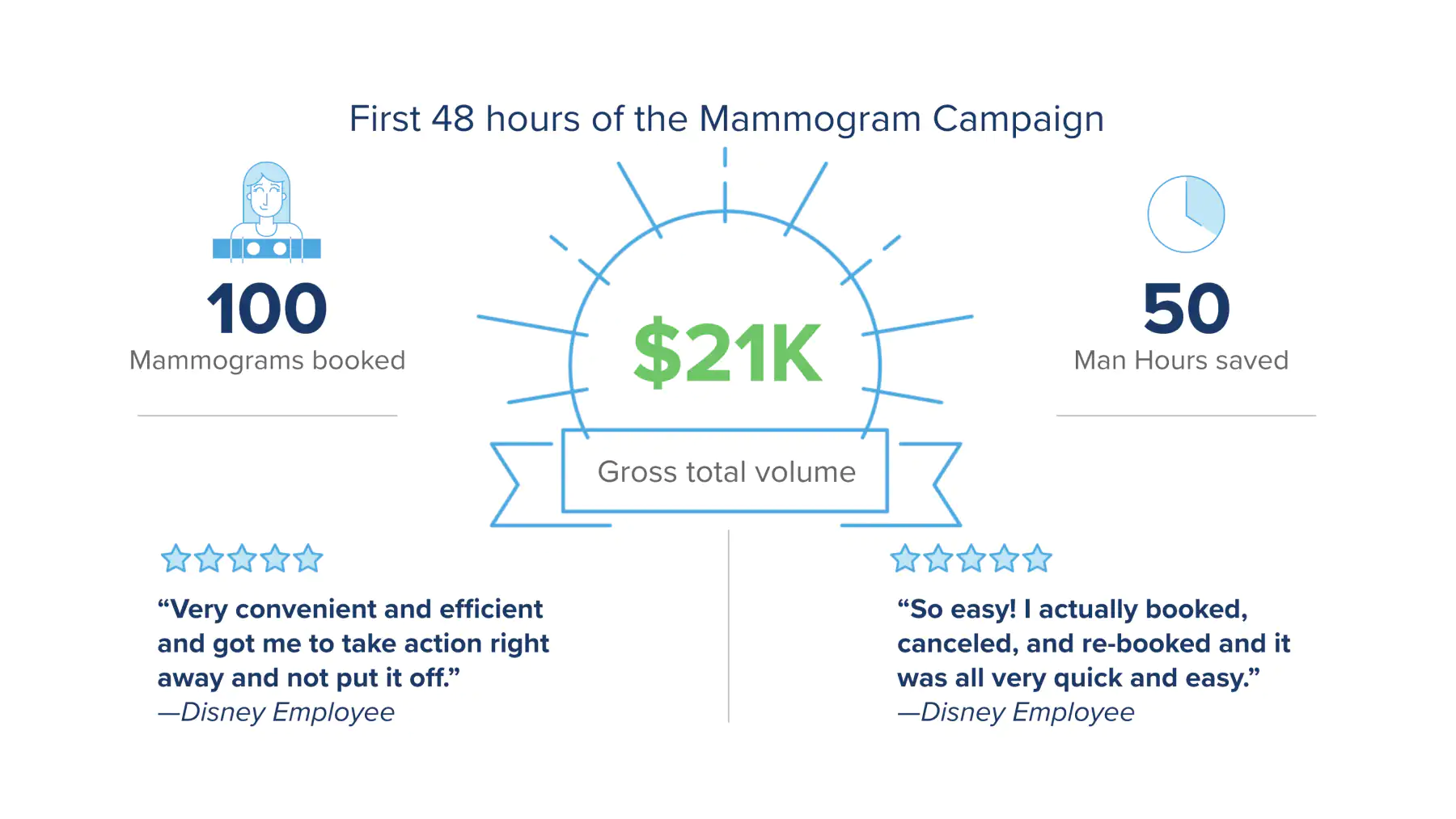
70%
More mammograms at Disney that year
Cologuard campaign
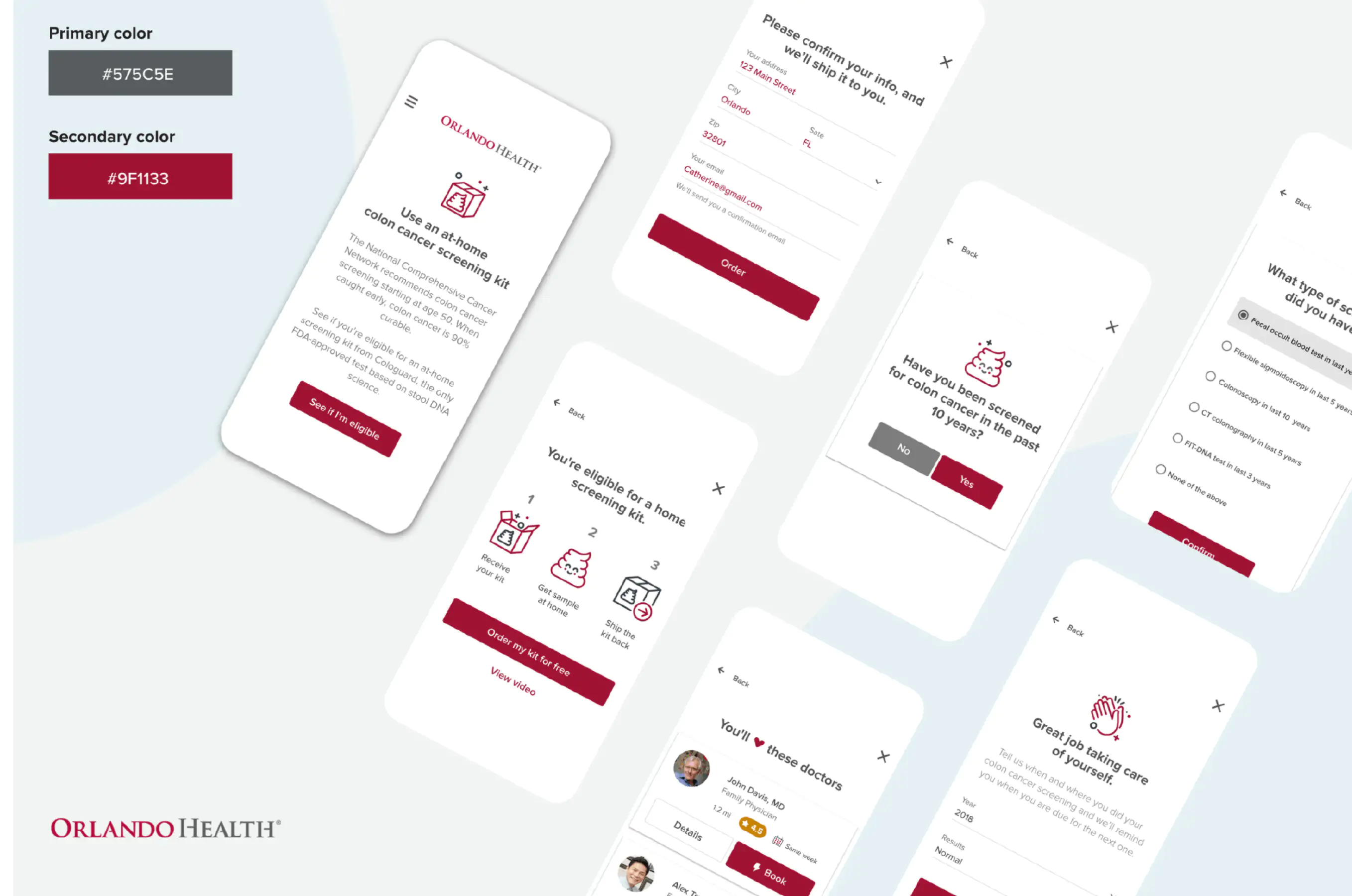
We later teamed up with Disney, Cologuard, and Orlando Health to offer eligible employees free at-home screening tests. By then I had hired two designers, and I worked closely with one of them on this campaign.
The brand system made room for partners: we brought the health system’s colors and logo into the whole experience.
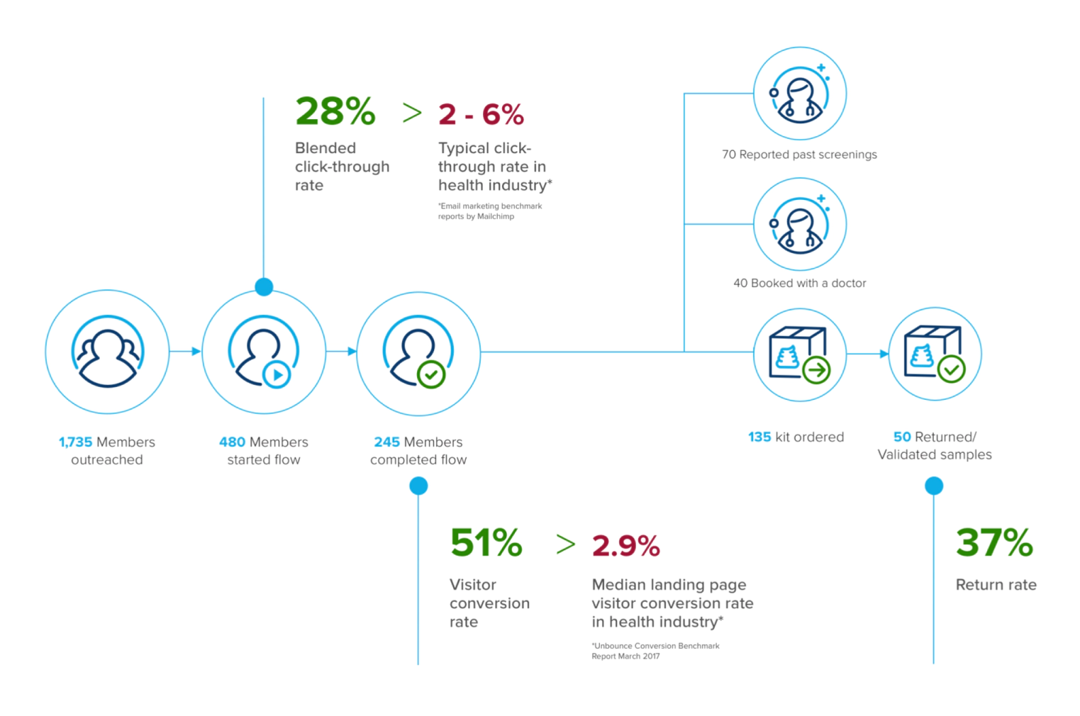
28%
Click-through rate, against 2–6% typical in healthcare
51%
Visitor conversion rate, against a 2.9% median
50
Kits returned with validated samples
Telling the story
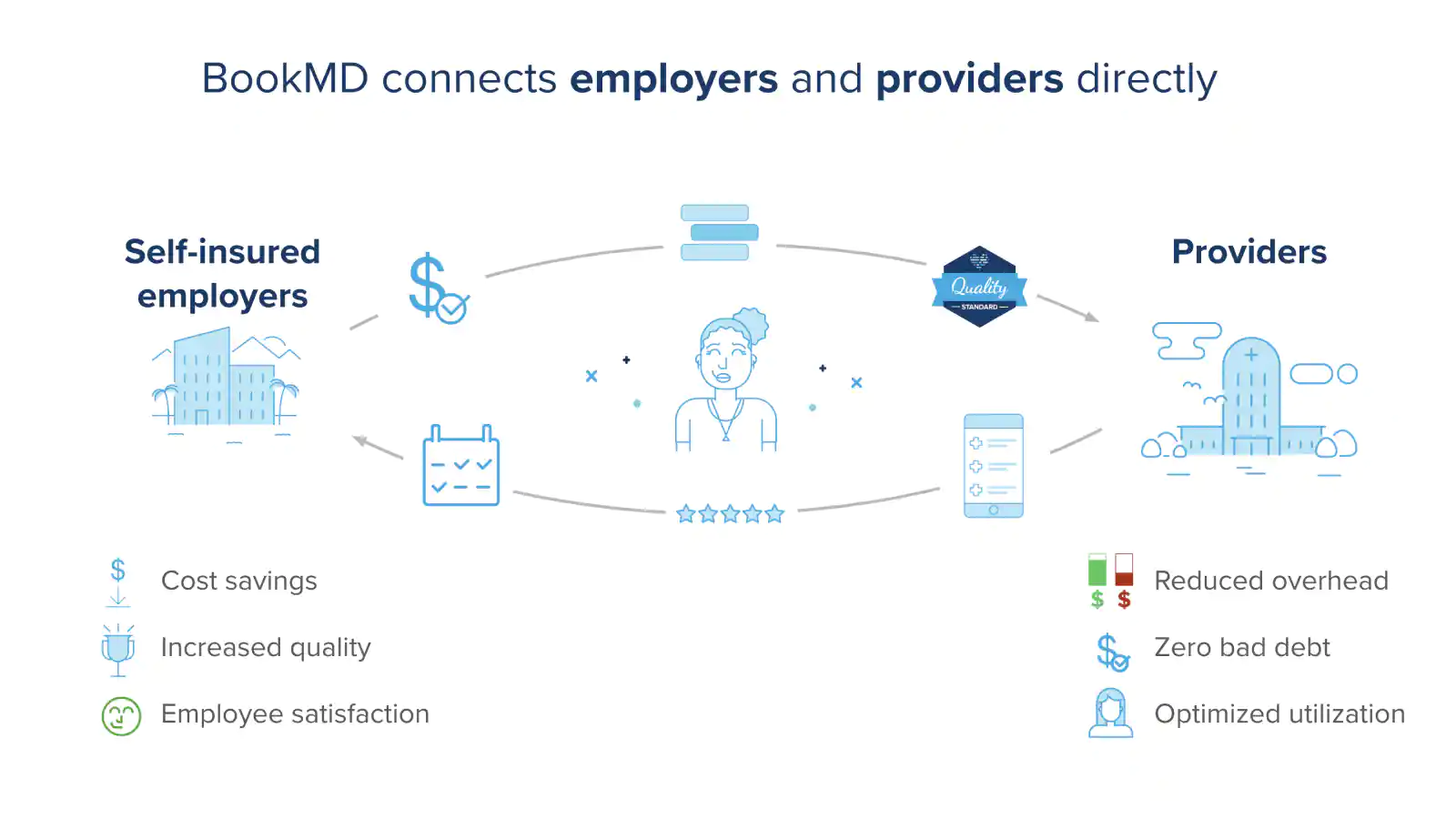
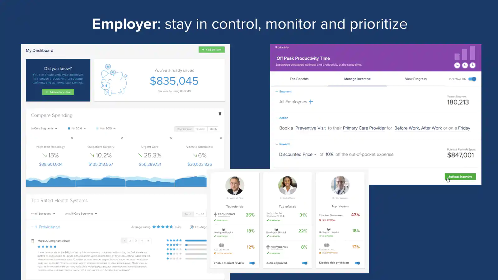
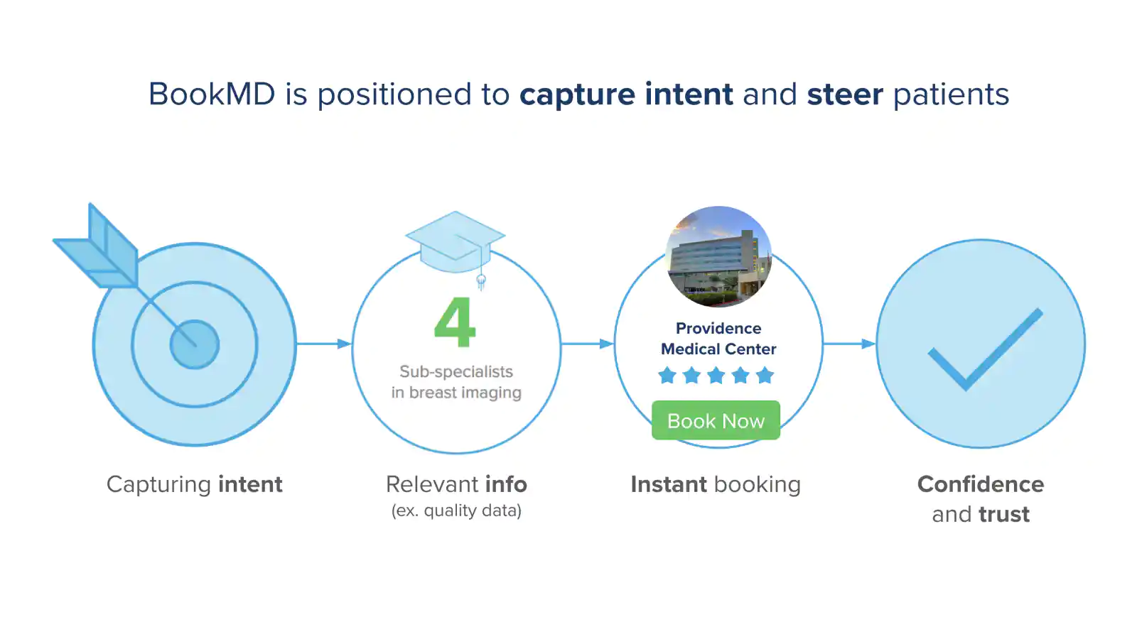
At Vim, I created product screens, visualized business strategies, crafted messaging, and made videos to help our leadership team bring our vision to life.
Our sales presentations had a high level of quality, detail, and polish, which let us tell a compelling story and build the strategic relationships we needed to grow.
Provider video
When we needed to tell our value-based care story to providers, I made a video. I wrote the concept and script, drew the illustrations, and did the voice-over, then brought in The Buzz Lab to storyboard and animate it.
The brand in the office
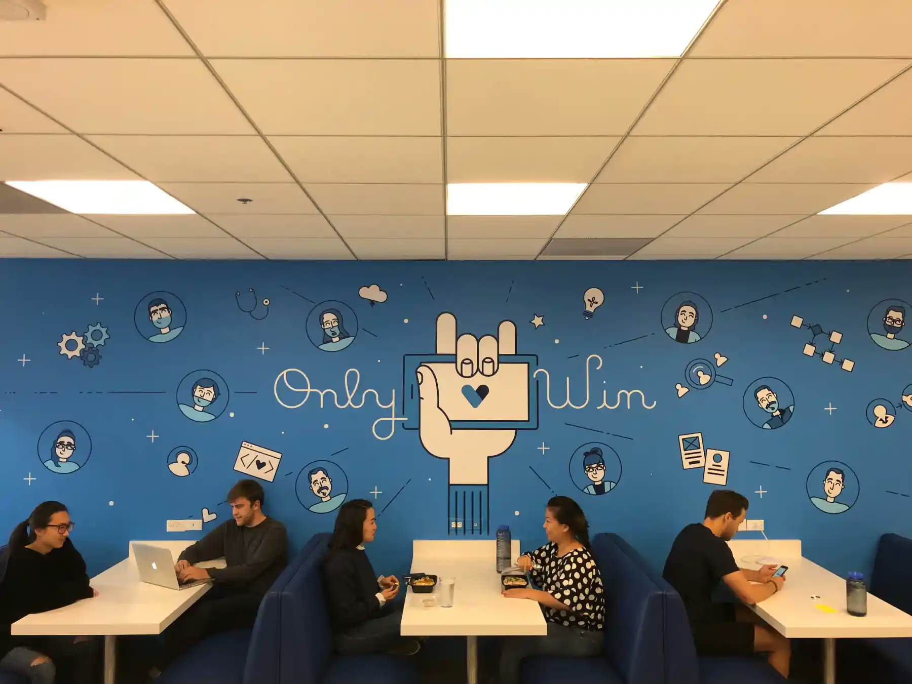
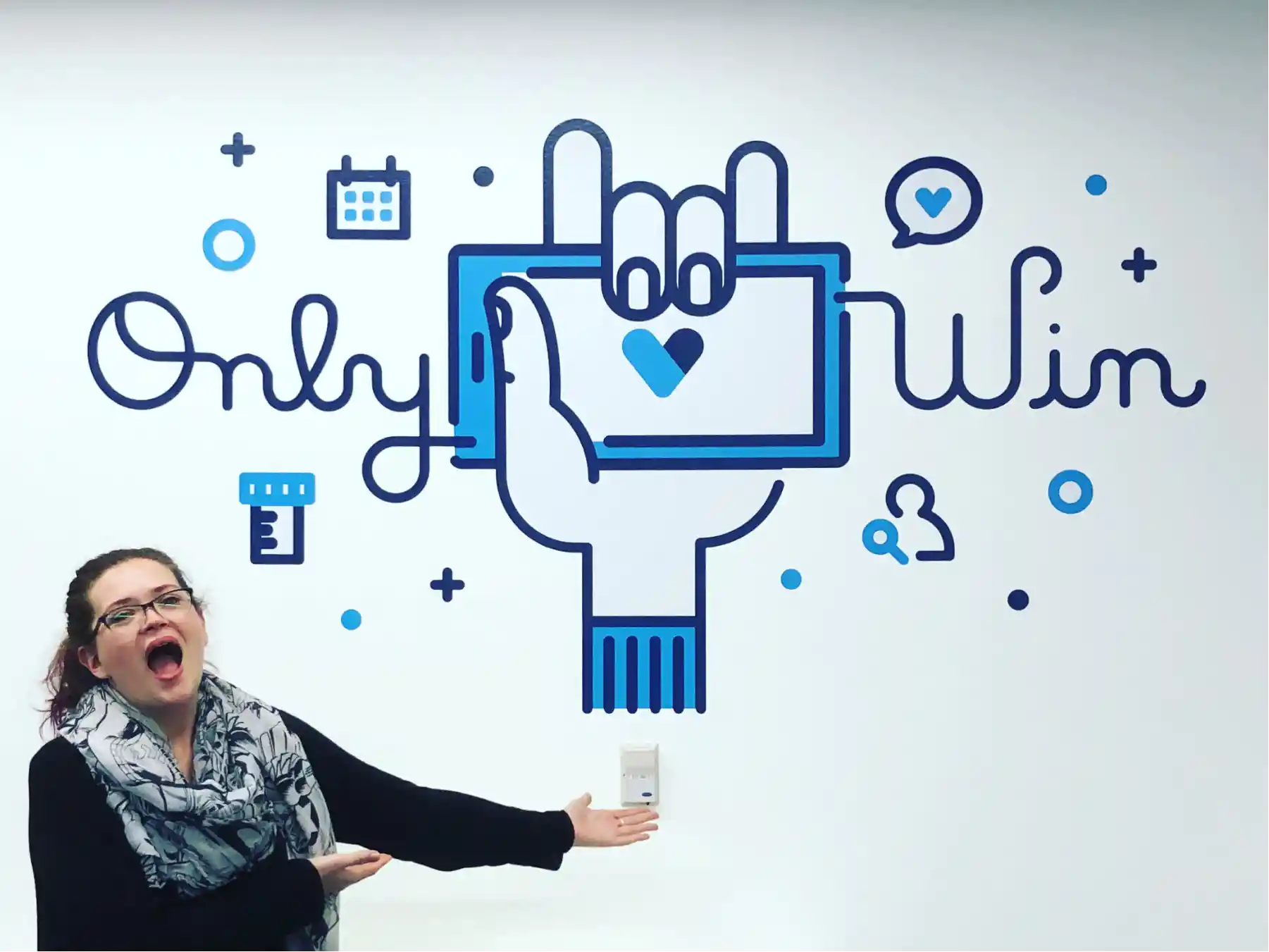
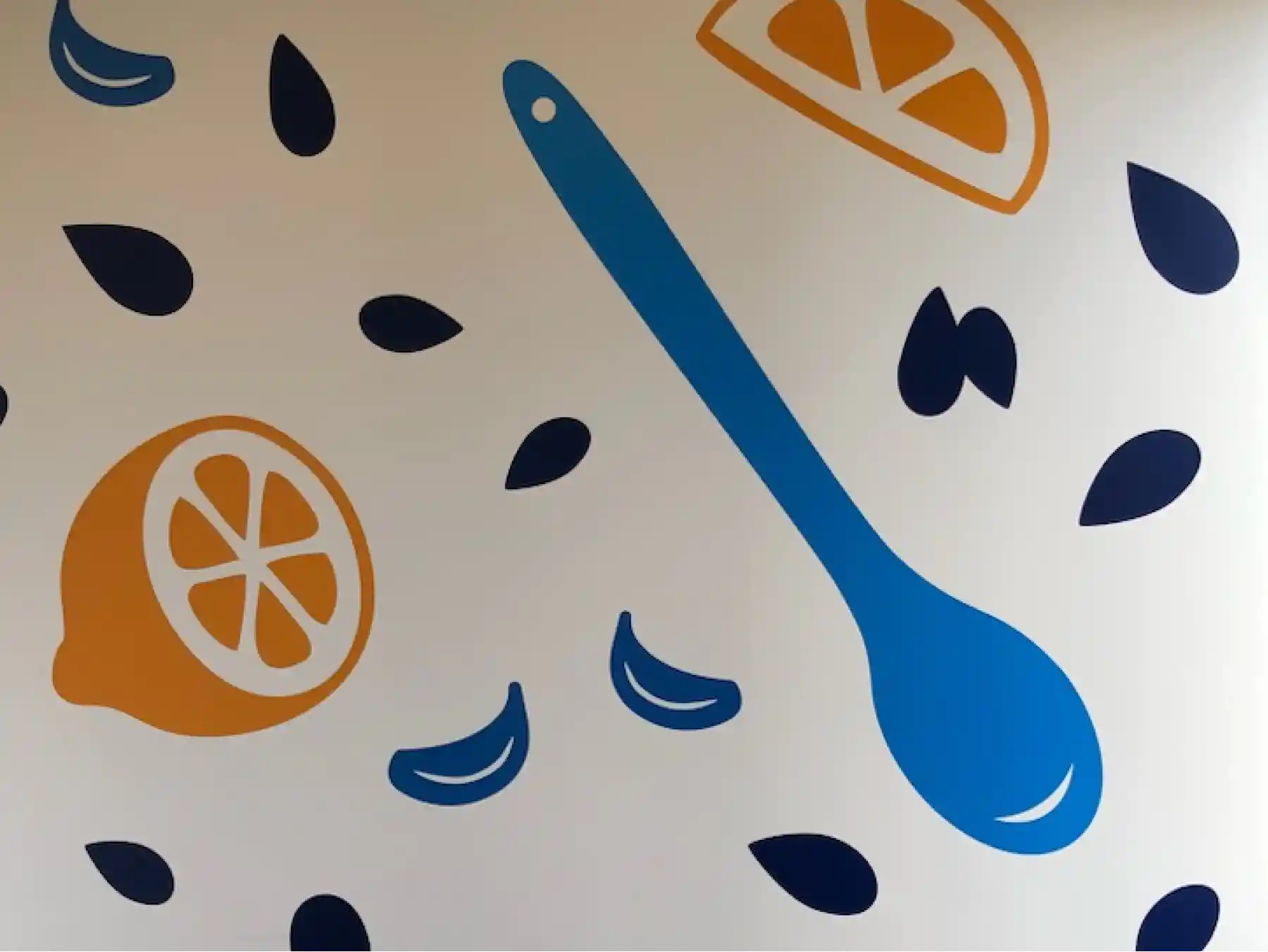
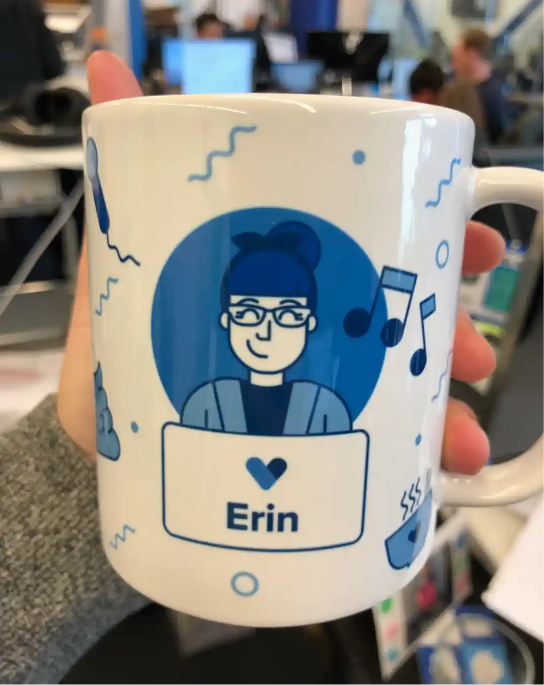
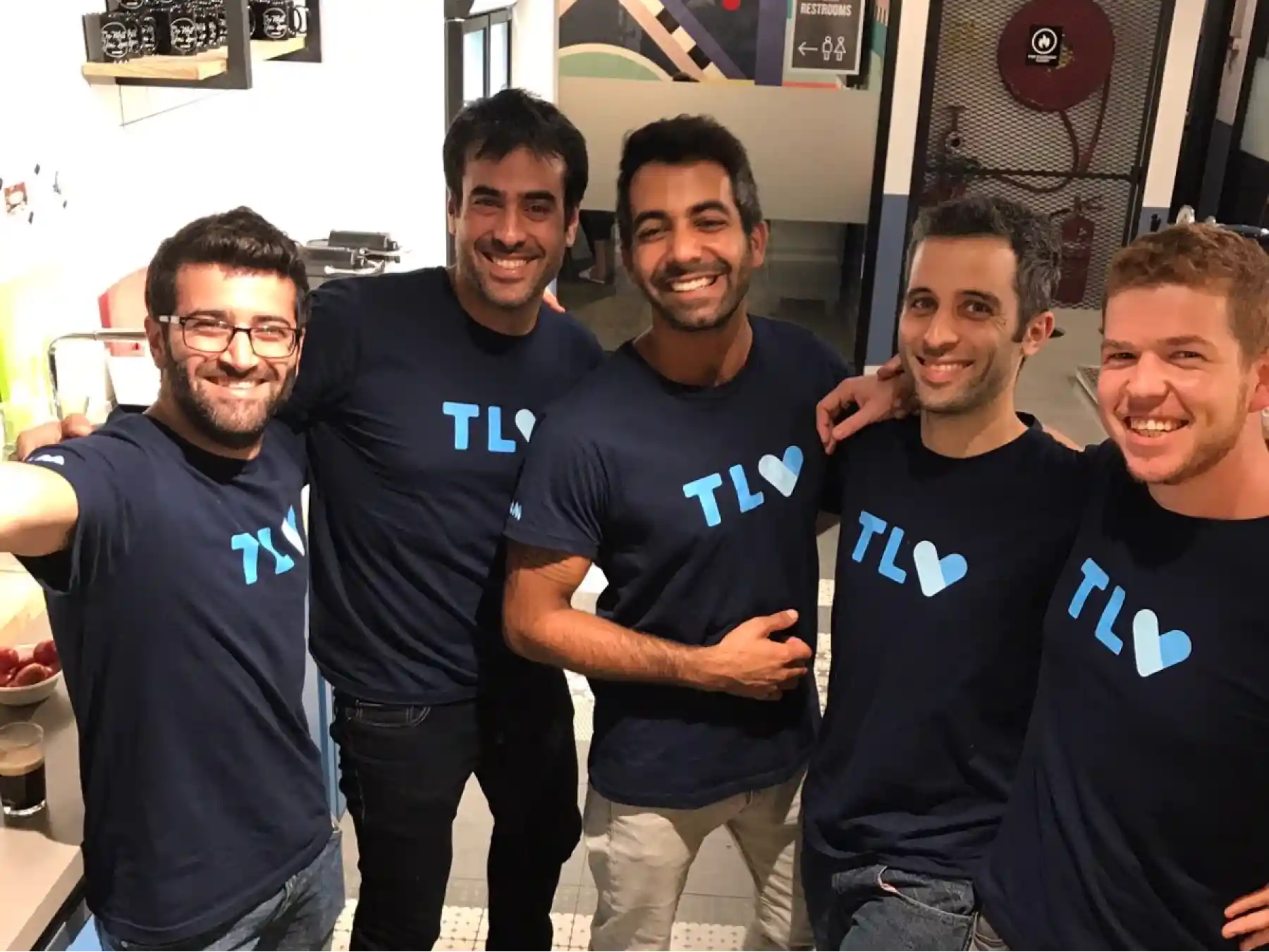
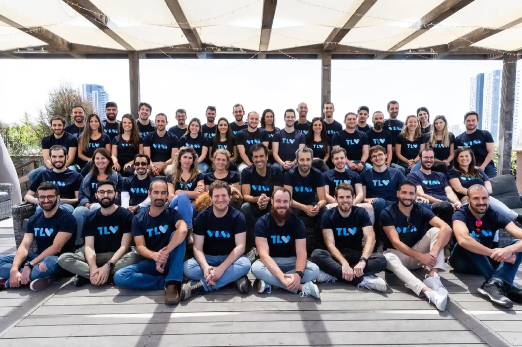
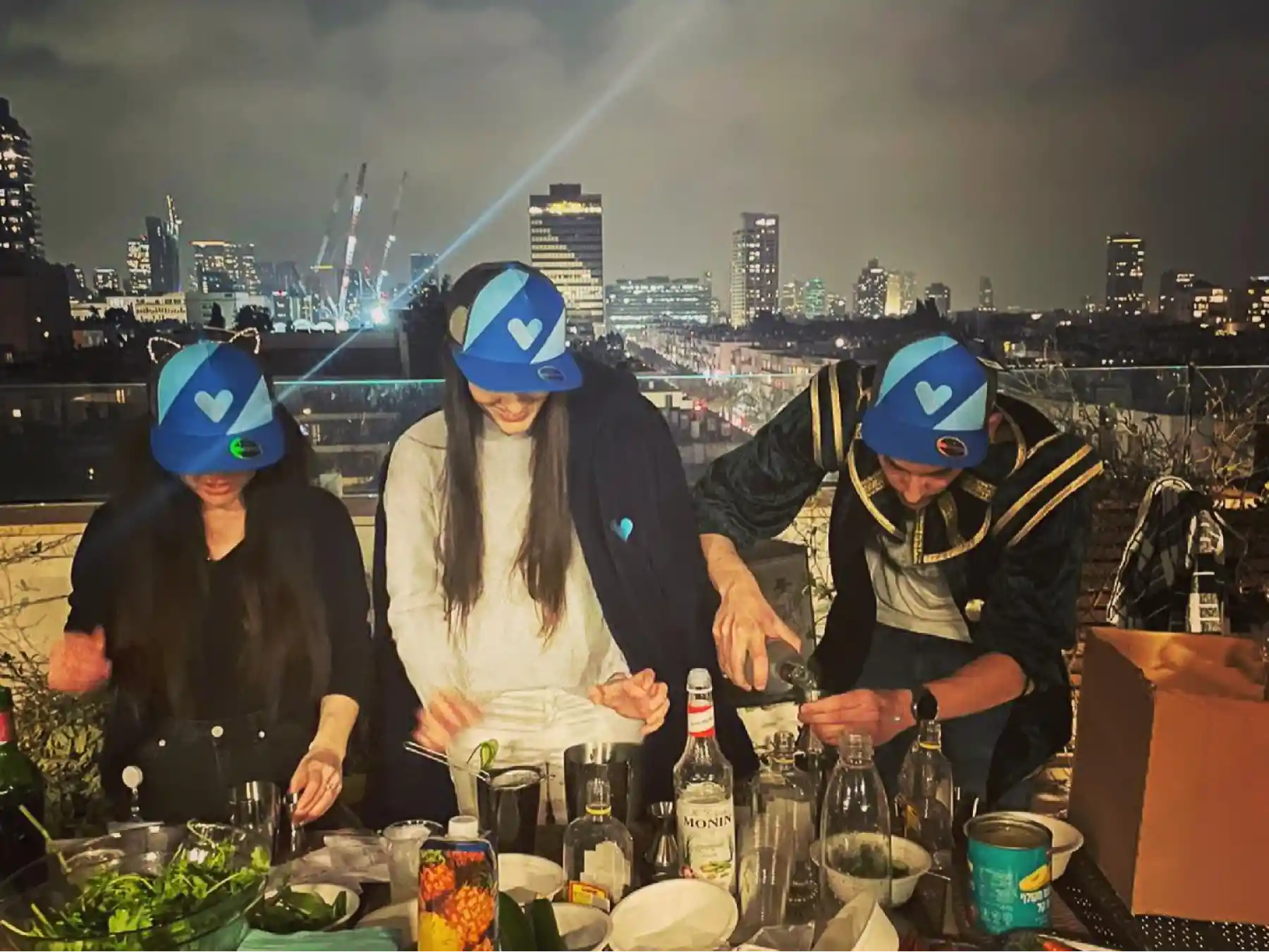
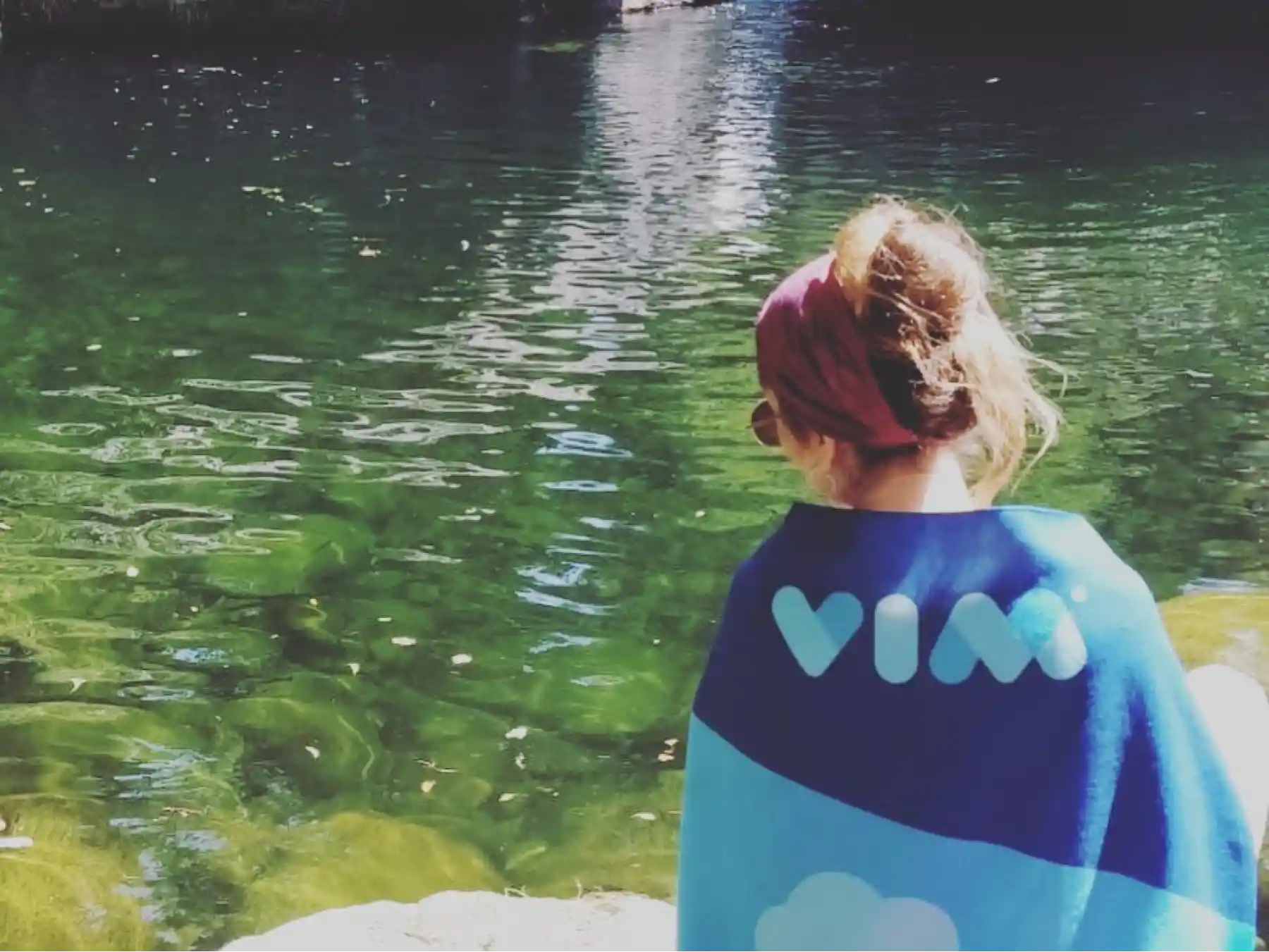
Vim’s founders have always cared deeply about a strong company culture, and they invested in bringing the visual identity into the office and beyond. I made swag and large-format illustrations for our offices. It was satisfying to see how the team responded and showed off Vim with pride.
A legacy that lives on
Vim has continued to secure funding, partners, and commercial contracts, growing significantly since it started. I’m proud to see the design system and culture I helped create live on today.